En la página "The JIRA Guide" de este blog podéis encontrar los enlaces actualizados a la última versión de la guía de JIRA en Español/Castellano que he estado redactando. La guía en cuestión recoge la documentación oficial de Atlassian, que he extendido con ejemplos y explicaciones más detalladas.
El Volumen I, ya disponible, está dedicado a los usuarios. En futuro publicaré también el Volumen II, dedicado a los administradores.
Al estado actual, la guía está actualizada con la documentación de JIRA 4.4. Para los impacientes: estoy ya revisando toda la guía para sincronizarla con la documentación de JIRA 5.0.
The JIRA Guide - Volumen I - Guía del Usuario (PDF), v. 1.00
Friday, March 23, 2012
Wednesday, March 21, 2012
A Review of My First Blurb Photo Books
This review is by no means scientific: I just express my own point of view and impressions. However, to avoid getting disappointed, I made sure I chose pictures where printing problems would be more likely to show up.
In fact, to conduct this test, I used good quality and sharp pictures with the following characteristics:
- Pictures with well saturated primary RGB colors (such as deep blue skies or almost pure greens).
- Pictures with several degrees of details in deep shadow areas.
- Pictures with large and soft color gradients (such as big skies printed on a two page layout).
- High key pictures with almost evanescent skin tones.
The characteristics of the books I ordered are the following:
- Format: Standard Landscape (10x8 inches, 25x20 centimeters).
- Cover: softcover and hardcover with dust jacket.
- Paper: Premium Lustre (148 g/m2).
- Number of pages: 40 (softcover), 80 (hardcover with dust jacket).
- Price: €28.69 (40 pages, softcover) and €36.74 (80 pages, hardcover with dust jacket).
If you're wondering, I ordered the book from Spain and it looks like they have been printed in The Netherlands: the origin, according to UPS tracking information, is Eindhoven. Take this into account if your experience is different than mine.
Overall Quality
The overall quality of the book is very good. Both covers are as good as expected and both seem very resistant. The softcover is somewhat thin, but not much thinner than the cover of any paperback you can get from any major publishing company.Bindings are very good and both have survived the "stress test" they were subjected to, including opening wide each and every page and applying a reasonable tension on the binding itself.
The only thing I'd really like, although I understand it's something impossible to ask for this price, is a sewn binding booklet. I've never seen a cheap paperback with one, however, let alone a unique copy of a book made exclusively for you.
In the next picture you can see the binding of the softcover book (the binding of the hardcover book is essentially the same):
 |
| The Binding |
The Premium Lustre paper has been a good surprise: this pretty heavy (148 g/m2) paper is very pleasant to touch and I'm satisfied with the print characteristics (more on this on the following sections). For most books I wouldn't buy the cheaper Standard paper nor the more expensive ProLine papers (although I'm curious to try it, too).
Color Fidelity
Rendering colors on devices with different gamuts inevitably causes problems. Blurb uses the CMYK process on HP Indigo presses (set at a resolution of 175 lpi) and I wanted to test how good (almost) pure RGB colors would render.When you're concerned about the color fidelity of a device output, you should always work with a color managed workflow. In my case, I'm working on a calibrated monitor and tried to soft-proof my images before sending them to Blurb in order to have an idea about what to expect.
Blurb provides only a generic ICC profile, which cannot be considered by any means reliable. To be so, they should provide a profile for every printer settings possibly used (to take into account parameters such as the paper you've chosen). However, out of curiosity, I decided to try the profile anyway and I did it both in Photoshop and in Aperture. (A warning for Lightroom users: Blurb's profile is a CMYK one and cannot be used in Lightroom. Don't even lose time trying).
As expected, according to the profile, the rendition of many colors would be much duller than the image on the monitor.
With my great surprise, the colors in the books I received are much better than what the profile had anticipated. In fact, at first sight, the perception I had deceived me into thinking that there was no shift at all. A closer inspection, however, revealed some loss in saturation in both blues and greens, but it was much smaller than expected.
Incidentally, the printed images and the out of gamut zones (as far as I can tell) correspond more with a soft proof made in Lightroom using the sRGB profile than with the soft proof made with the Blurb ICC profile.
As stated earlier, I haven't tried any paper other than the Premium Lustre. I suppose that the result using ProLine papers would be even better.
This is a photo of the book cover and the original picture sent to blurb (cropped):
 |
| Book Cover - Photo |
 |
| Original Picture (Cropped) |
Colors are satisfactorily rendered both in the shadows and in the highlights range. In the following picture you can see a close-up of a printed high-key image where the color texture is nowhere near to fading away:
 |
| Close-up (approx. 5x) of a Printed High Key Image |
The original colors in the model forehead are close to Adobe RGB (240, 230, 230) and the printed version is pretty faithful.
Print Quality
The print quality of the book is very good. After careful review, I haven't spotted any problem whatsoever. Soft color gradients, even in problematic color zones, show no banding nor posterization. Here's a 100% crop of the previous picture so that you can appreciate how the blue smoothly transitions from darker to lighter: |
| Smooth Color Gradient |
To be honest, if you inspect an image very closely, you can recognize a characteristic banding of the printing process (not very dissimilar to the texture of classical offset printing), but it's really, really hard to notice with naked eye. Here's an extremely magnified picture:
 |
| Close Detail |
Conclusion
I'm very pleased with Blurb photo books and I'm likely to order more in the near future. The quality-price ratio is very good: according to my experience, it even exceeds expectations, especially if you consider the cost of a page. Here you can see Blurb pricing policy, summing it all up:- You pay a base €19.49 for a Standard Landscape book (10x8 in, 25x20 cm) with 20 Premium Lustre pages.
- You pay additional €5 difference to get a book in the 20-40 pages range.
- You pay additional €10 difference to get a book in the 40-80 pages range, and so on.
20 more pages cost a maximum of €5, or €0.25/page.
Let's consider a direct Blurb's competitor I had the masochistic pleasure to try: Apple (with its iPhoto books). A book of the same characteristics (L-size, 20 pages, softcover), without even the possibility of choosing a paper quality, is offered here in Spain for an initial price of €20.05. The maximum number of pages per book is 100 for an additional fee of €0.70 a page.
A ridiculously high price, especially when comparing the quality of the two products. In my opinion, Blurb books have an overall better quality, especially as far as printing is concerned. Maybe, some users choose to print an iPhoto book because of the supposed user-friendliness of their tools. Being honest and trying to step back, I consider this a myth easy to debunk. Just try one of the several applications that Blurb offers to publish a photo book. I tried all of them, including the Bookify web application, and they're perfectly usable for users of any proficiency.
As a plus, if you're an amateur or a pro who owns Adobe Lightroom or InDesign, you can now design and publish a book directly from your favorite application, without any disruption of your workflow. If you're curious, in another post in the Lightroom Tutorial series I described the new Book module that appeared with Lightroom 4.
Adobe Photoshop Lightroom Tutorial - Part XXII - Adjustment Brushes
Part I - Index and Introduction
A couple of posts ago we introduced graduated filters and saw how they can be used to quickly apply a wide range of adjustments in a picture, mimicking and enhancing the behaviour of physical graduated filters we use to attach to our lenses.
The only problem with graduated filters is intrinsic to their behaviour: as we've seen, you basically set the filter axis (a straight line) and the adjustments are applied on the part of the image contained on the half-plane defined by the filter axis and direction. Although other geometries are possible, most physical graduated filters work exactly like this:
This kind of filter geometry is excellent (and easy to use) if you've got a straight line over which to lay the filter axis, such as the horizon. However, things get tough if you haven't got it: it's sufficient that even a small portion of the image unavoidably intrudes into the filtered zone (such as a mountain and a tower bell) and you'll end up with undesired results.
Look at the following image:
I took this picture on a trip to The Netherlands: we passed in front of Peace Palace, in The Hague, we stopped our car and I tried to take some shots from the only feasible position (the palace was closed). I couldn't wait for the sun to be in a better position, and this is the result: the sky is too bright with respect to the palace.
If I had used a graduated filter to stop down the sky, pretty much of the clock tower on the left would have darkened as well, which is unacceptable, since it's part of the picture's main subject. There are many solutions to this problem: I could have bracketed the exposure and blended multiple images together, for example. In this case, however, I could retrieve sufficient details in the shadows without blowing the highlights, which makes this image feasible to be fixed in post-production.
The fundamental difference is that you can brush in the adjustments exactly where you need them. This is the adjustment brush panel in the Develop module, that you can open in using one of this methods:
In the Mask section of the panel, you can choose whether you're creating a new brush or editing an existing one. If the picture has been applied other adjustment brushes, you can select them using their circular grey handle, which appears in the place you apply the first stroke of a brush:
Using the Effect drop down menu you can select an available preset. Lightroom ships many of them, and you can also save your own should a brush configuration be used often in the future.
A brush configuration can be applied using the adjustment sliders it offers. Adjustments can be modified at any time and the configuration change will be immediately reflected on the picture.
To brush an effect into the picture, you've got to select the brush properties in the Brush section of the panel, which are used to mimic the properties of a physical brush:
Flow and density are more useful when you're brushing in using the mouse. If you're brushing in using a pressure-sensitive device, such as a pen tablet (which is something I strongly recommend for advanced adjustments. See more at the end of this post), flow becomes less important since you can achieve the same effect applying different pressures on the pen.
The brush Auto Mask feature is often overlooked, but it's feature of paramount importance: it confines brush strokes into zones of similar colors. It's useful to auto-detect the edges of the area you're brushing in and it can incredibly speed up your workflow.
Since the edge between the sky and the Peace Palace is quite irregular, it would be very time expensive trying to mask it manually without producing harsh transitions or halos around the edge. Since I'm brushing over the sky, which is pretty uniform in color and much lighter than the palace, I will turn the Auto Mask feature on and have Lightroom auto-detect the edges between the sky and the surrounding objects which, in this case, have a pretty irregular edge.
When you're brushing an adjustment, sometimes it's not easily discernible where the adjustment has been applied. In that case, you can turn on the Show Selected Mask Overlay feature (found on the bottom of the image), that will highlight the brushed in zones in a different color:
Alternatively, you can use the following alternatives:
In the following detail you can see the brush overlay mask highlighted in green:
As you can see, Lightroom made a great job detecting the edges between the sky and the palace and only few correction are required.
To erase part of the brush overlay mask, in case you stepped over a zone you don't want to adjust, you can remove it from the brush mask simply selecting Erase in the Brush configuration field and brush out the undesired zone.
The result brush overly mask and the resulting image are the following:
As you can see, the final brush mask over the sky is nearly perfect and I only applied minor tweaks to it. In less than a few minutes, this step of the processing was done. In the final image, besides stepping down the sky about 1 f/stop, I also applied the following adjustments:
You can have a look at these posts for more information and further example:
Even smaller graphics tablets will give you a degree of control over your brushing that's simply unmatchable using a point-and-click devices such as a mouse (or a trackpad). Also, once you get used to them, chances are you'll use them as your only pointing device as well, at least when you're at your desk.
At the bottom of this post you'll find some Amazon's link to some entry level tablets where you can start your investigation from.
If you want to help me keep on writing this blog, buy your Adobe Photoshop licenses at the best price on Amazon using the links below.
A couple of posts ago we introduced graduated filters and saw how they can be used to quickly apply a wide range of adjustments in a picture, mimicking and enhancing the behaviour of physical graduated filters we use to attach to our lenses.
The only problem with graduated filters is intrinsic to their behaviour: as we've seen, you basically set the filter axis (a straight line) and the adjustments are applied on the part of the image contained on the half-plane defined by the filter axis and direction. Although other geometries are possible, most physical graduated filters work exactly like this:
 |
| Colored and Graduated Filter (Hoya) |
This kind of filter geometry is excellent (and easy to use) if you've got a straight line over which to lay the filter axis, such as the horizon. However, things get tough if you haven't got it: it's sufficient that even a small portion of the image unavoidably intrudes into the filtered zone (such as a mountain and a tower bell) and you'll end up with undesired results.
Look at the following image:
 |
| The Hague - Peace Palace |
I took this picture on a trip to The Netherlands: we passed in front of Peace Palace, in The Hague, we stopped our car and I tried to take some shots from the only feasible position (the palace was closed). I couldn't wait for the sun to be in a better position, and this is the result: the sky is too bright with respect to the palace.
If I had used a graduated filter to stop down the sky, pretty much of the clock tower on the left would have darkened as well, which is unacceptable, since it's part of the picture's main subject. There are many solutions to this problem: I could have bracketed the exposure and blended multiple images together, for example. In this case, however, I could retrieve sufficient details in the shadows without blowing the highlights, which makes this image feasible to be fixed in post-production.
Adjustment Brushes
An adjustment brush offers the same set of adjustments of graduated filters:- Color temperature and tint.
- Basic tone controls: Exposure, contrast, highlights and shadows.
- Clarity.
- Saturation.
- Sharpness.
- Noise.
- Moiré.
- Color.
The fundamental difference is that you can brush in the adjustments exactly where you need them. This is the adjustment brush panel in the Develop module, that you can open in using one of this methods:
- Selecting the Tools/Adjustment Brush menu item.
- Selecting the graduated filter icon on the tool strip (described in a previous post).
- Using the 'K' keyboard shortcut.
 |
| Adjustment Brush Panel |
In the Mask section of the panel, you can choose whether you're creating a new brush or editing an existing one. If the picture has been applied other adjustment brushes, you can select them using their circular grey handle, which appears in the place you apply the first stroke of a brush:
 |
| Brush Handle in a Picture |
Using the Effect drop down menu you can select an available preset. Lightroom ships many of them, and you can also save your own should a brush configuration be used often in the future.
A brush configuration can be applied using the adjustment sliders it offers. Adjustments can be modified at any time and the configuration change will be immediately reflected on the picture.
To brush an effect into the picture, you've got to select the brush properties in the Brush section of the panel, which are used to mimic the properties of a physical brush:
- Size: the size of the circular area where the adjustment is applied.
- Feather: the size of the "ring" around the brush where adjustment will be gradually faded to zero. A feather of 0 will produce a perfectly round shaped "hard" brush. The greater the feather, the smoother the brush transition at its edge.
- Flow: the rate of application of the effect.
- Density: the amount of transparency of the brush stroke.
Flow and density are more useful when you're brushing in using the mouse. If you're brushing in using a pressure-sensitive device, such as a pen tablet (which is something I strongly recommend for advanced adjustments. See more at the end of this post), flow becomes less important since you can achieve the same effect applying different pressures on the pen.
The brush Auto Mask feature is often overlooked, but it's feature of paramount importance: it confines brush strokes into zones of similar colors. It's useful to auto-detect the edges of the area you're brushing in and it can incredibly speed up your workflow.
Applying an Adjustment: Some Initial Tips
When applying any adjustment, you want it to look natural. As a rule of thumb, strong gradients very seldom do, so that the following tips apply:- Start with "soft" brushes: relatively big sizes and some feather will help you achieve smooth adjustments with soft edges.
- When brushing around an edge between zones with very different luminosity, try to avoid producing halos. Sometimes is better having the adjustment overlap the edge into the zone where the applied adjustment is less noticeable. If you're applying a burning, or darkening, effect (such as in this case), the darkening will be less noticeable when overlapping into the darkest zone rather than having a bright halo around the edges.
- When possible, use the Auto Mask feature described in the following sections.
Auto Masking
To fix the sky in the previous picture I can brush in an exposure adjustment. As a starting point, I will try brushing in a -1 exposure adjustment. Since the sky is a pretty big portion of the image, I will brush in the adjustment starting with a pretty big and opaque brush with a relatively big feather.Since the edge between the sky and the Peace Palace is quite irregular, it would be very time expensive trying to mask it manually without producing harsh transitions or halos around the edge. Since I'm brushing over the sky, which is pretty uniform in color and much lighter than the palace, I will turn the Auto Mask feature on and have Lightroom auto-detect the edges between the sky and the surrounding objects which, in this case, have a pretty irregular edge.
When you're brushing an adjustment, sometimes it's not easily discernible where the adjustment has been applied. In that case, you can turn on the Show Selected Mask Overlay feature (found on the bottom of the image), that will highlight the brushed in zones in a different color:
| Showing a Brush Overlay Mask |
Alternatively, you can use the following alternatives:
- The Tools/Adjustment Brush Overlay menu and sub-items.
- Using the 'O' keyboard shortcut.
- Use the Tools/Adjustment Brush Overlay menu and sub-items.
- Us the 'Shift-O' keyboard shortcut.
In the following detail you can see the brush overlay mask highlighted in green:
 |
| Brush Overlay Mask |
As you can see, Lightroom made a great job detecting the edges between the sky and the palace and only few correction are required.
To erase part of the brush overlay mask, in case you stepped over a zone you don't want to adjust, you can remove it from the brush mask simply selecting Erase in the Brush configuration field and brush out the undesired zone.
The result brush overly mask and the resulting image are the following:
 |
| Final Brush Overlay Mask Over the Sky |
 |
| Final Image |
As you can see, the final brush mask over the sky is nearly perfect and I only applied minor tweaks to it. In less than a few minutes, this step of the processing was done. In the final image, besides stepping down the sky about 1 f/stop, I also applied the following adjustments:
- I added some clarity, to enhance the local contrast and make the clouds pop-up (the day was a bit foggy).
- I raised the saturation a bit (+20): since the sky is blue, raising a bit its saturation will also contribute to the darkening effect.
Other Common Adjustment Scenarios
The limit to the range of adjustments you can brush into your pictures is set only by your creativity. However, here are some common scenarios I often uses adjustments brushes in:- Enhancing the iris of a model: increasing exposure, clarity and saturation.
- Whitening the sclera (the "white of the eye") of a model: increasing exposure and decreasing saturation.
- Whitening the teeth of a model: increasing exposure and decreasing saturation.
- Softening the skin of a model: decreasing clarity.
- Burn (darken) a sky.
- Dodge (lighten) part of an image to recover details in shadows too deep.
- Modify the contrast in selected parts of an image, such as clouds or fog.
You can have a look at these posts for more information and further example:
- Smoothing the Skin Reducing Local Contrast Using Layers: this post can be easily adapted to Lightroom changing the unsharpen mask for a brushed-in a negative clarity adjustment.
- Adobe Photoshop Lightroom Tutorial - Part XIII - Using Presence Controls To Enhance The Eyes.
- Adobe Photoshop Lightroom Tutorial - Part XIV - Using Presence Controls to Smooth the Skin.
Use a Graphics Tablet to Get Better Adjustment Brushing
Graphics tablets aren't commonly found on the desk of amateurs, let alone common users. However, they're devices that can drastically improve both the quality and the range of adjustments you apply in post production. Nowadays, an entry level tablet (such as Wacom's Bamboo, starting at about $60) can cost as much as a good mouse or trackpad and, in my opinion, is a much better investment for an amateur photographer.Even smaller graphics tablets will give you a degree of control over your brushing that's simply unmatchable using a point-and-click devices such as a mouse (or a trackpad). Also, once you get used to them, chances are you'll use them as your only pointing device as well, at least when you're at your desk.
At the bottom of this post you'll find some Amazon's link to some entry level tablets where you can start your investigation from.
Conclusion
Adjustment brushes are an easy way to locally apply a wide range of adjustments offered by Lightroom. Any opportunity not to leave Lightroom to edit a picture in an external program is a great advantage in terms of speed, efficiency and flexibility. Not only you're able to apply a wide range of adjustments without leaving the program, but you're also able to modify them on the fly taking advantage of Lightroom's non destructive workflow.If you want to help me keep on writing this blog, buy your Adobe Photoshop licenses at the best price on Amazon using the links below.
Monday, March 19, 2012
Adobe Photoshop Lightroom Tutorial - Part XXI - Making Photo Books
Part I - Index and Introduction
Part XXII - Adjustment Brushes
An interesting new feature introduced in Lightroom 4 is the possibility of creating photo books. Lightroom features a new module, called Book, where you can easily create a photo book out of a collection of pictures and save the book itself as a new kind of collection.
The new Book module is seamlessly integrated into the Lightroom workflow and you can freely jump from module to module in case you need to modify the underlying collection of photos or modify the develop settings of a picture. As usual, changes applied to a certain picture will automatically be reflected in every collection containing a reference to the same picture. Alternatively, you can have Lightroom automatically create new virtual copies of the pictures added to a book collection to isolate the changes specifically applied to pictures of a book.
The Book module features a pretty powerful WYSIWYG editor offering plenty of configurable page templates. In my opinion, the book editor was thought with simplicity in mind and is aimed at amateurs. This tool is very easy to use and will allow you to create beautiful photo books with little effort and in a short time. As such, it isn't as flexible as a fully fledged desktop publishing solution and advanced users may soon realize its shortcomings, especially as far as page and template configuration is concerned. Users of Blurb BookSmart, a tool that was probably used as the bases for the Book module, will probably consider the latter a stripped-down version of the former, especially considering the good integration that can be achieved between BookSmart and Lightroom 3 using Blurb's plugins. However, choice is good and different users will choose the tool that best suits their needs.
Once finished, a book can be exported to PDF or sent out for printing. At the moment, no Print-On-Demand service other than Blurb is available (which is, however, a good choice in terms of quality-price-ratio).
In the previous picture you can see the Book module with an empty book layout. In the left panel you can see the Collections browser and in the filmstrip you can see the pictures contained in the library folder I was using when I switched to the Books module. As you see, you will be able to pick images from different collections but you won't be able to access a different folder. Hence, you should create the collections you need before creating your book if the images you plan to include into your book are scattered throughout different library folders.
As we'll see, when you save a book Lightroom will create a new collection (the book itself) selected images will be added to. Lightroom will also give you the option to create new virtual copies of the images used in the book, a very handy feature in case you want to isolate specific changes you need to apply to the book images (such as sharpening).
The Book Settings panel (configured for a PDF book) can be seen in the following picture:
In the Book field you can choose the book type you want to produce, and in this case it's PDF book. In the Size and Cover fields you can configure the physical layout of the book. In the current version, the following sizes are supported (which, incidentally, are the same sizes offered by Blurb):
As far as the covers are concerned, these are the available options:
First of all, you can choose the paper type for your book. At the moment, the following options are available (further information can be found on the Blurb website):
Interestingly, the cheapest Standard (118 GSM) paper isn't an available option. Since you cannot downgrade a book's paper using Blurb's web interface, if you want to print a book on standard paper using Blurb, you've got to make a PDF book and upload it to Blurb manually.
Personally, I don't appreciate this deliberate lack of choice. I admit I mostly use Premium paper for my books, but I don't like being forced to choose between uploading through the Book module and paying for a more expensive paper or going through the cumbersome process of uploading a PDF to Blurb manually.
Finally, you can choose whether you want your book to have a Blurb's logo page (the default option) or remove it from your book and pay the corresponding fee.
A good place to start is the Auto Layout panel. Instead of laying out all the images by hand, you can have Lightroom lay them out automatically using a specified preset and then apply the modification you require:
Fist of all, you've got to choose a page layout that Lightroom will use as a template for all the pages of the book. You can use an available preset or create one of your own. The bundled preset are designed to layout a single image on every page. If you want to modify an existing preset, or create a new one from scratch, you can choose Edit Auto Layout Preset… in the Preset list box and a configuration window will appear:
Using the Auto Layout Preset Editor, you can define the default layout used by Lightroom, specifying:
Once the chosen preset has been set, you can press the Auto Layout button to have Lightroom create your book. In case you don't like the result and change your mind about the desired layout, you can use the Clear Layout button to clear the book and start again.
Once an image is dropped, its size can be changed using the zoom slider that appear above it. If it does not, just select the image by clicking on it:
If you want to change the layout of a page, you can select it (clicking on the area just below it) and choose the desired layout in the Page panel or using the popup that can be accessed using the small black button on the bottom right corner of the page (visible on the previous image). Many available templates are available to place one, two, three or four image per page. Also, a great deal of creative templates are available in case you need to create more unconventional page layouts. Still, since page layouts cannot be customized, some users may find the available options insufficient.
An interesting layout featured by this module is the possibility of easily making two-page spreads like the one shown in the following image:
The Cell panel can be used to change an image padding:
Using the Amount slider, you can change the padding of the selected image cell. In the following image you can see the effect achieved applying a 60 points padding to a test image:
Since available page layout cannot be modified, you will find cell padding more useful than you may think at first sight.
The Caption panel lets you add captions to an image, to a page or to both of them:
Photo captions can be positioned above, over or below a photo and there can be one per photo. On the other hand, page captions can be positioned above, over or below a single page and there can only be one per page. In the following picture you can see an example of both a photo and a page caption:
The text of either caption can be formatted using the tools available on the Type panel, a pretty basic text formatting tool that needs to be enhanced:
Besides common collection attributes such as name and placement, there are specific book options that are pretty handy:
If, on the other hand, you want to publish a Blurb book and send it for printing, you've got to use the Send Book to Blurb… button located at the bottom of the right side panel.
Moreover, and more importantly, this module is well integrated into Lightroom and you will continue to benefit from its the goodies without any disruption to your workflow. While it's true that it's not very flexible, even less than the original tool it's derived from (Blurb BookSmart), it has the great advantage of being an integral part of Lightroom and your productivity will surely benefit from it. Should you need a more complex tool, you could switch to a fully fledged desktop publishing solution (such as Adobe InDesign).
If you want to help me keep on writing this blog, buy your Adobe Photoshop licenses at the best price on Amazon using the links below.
Part XXII - Adjustment Brushes
An interesting new feature introduced in Lightroom 4 is the possibility of creating photo books. Lightroom features a new module, called Book, where you can easily create a photo book out of a collection of pictures and save the book itself as a new kind of collection.
The new Book module is seamlessly integrated into the Lightroom workflow and you can freely jump from module to module in case you need to modify the underlying collection of photos or modify the develop settings of a picture. As usual, changes applied to a certain picture will automatically be reflected in every collection containing a reference to the same picture. Alternatively, you can have Lightroom automatically create new virtual copies of the pictures added to a book collection to isolate the changes specifically applied to pictures of a book.
The Book module features a pretty powerful WYSIWYG editor offering plenty of configurable page templates. In my opinion, the book editor was thought with simplicity in mind and is aimed at amateurs. This tool is very easy to use and will allow you to create beautiful photo books with little effort and in a short time. As such, it isn't as flexible as a fully fledged desktop publishing solution and advanced users may soon realize its shortcomings, especially as far as page and template configuration is concerned. Users of Blurb BookSmart, a tool that was probably used as the bases for the Book module, will probably consider the latter a stripped-down version of the former, especially considering the good integration that can be achieved between BookSmart and Lightroom 3 using Blurb's plugins. However, choice is good and different users will choose the tool that best suits their needs.
Once finished, a book can be exported to PDF or sent out for printing. At the moment, no Print-On-Demand service other than Blurb is available (which is, however, a good choice in terms of quality-price-ratio).
Creating a Book
A book can be created or edited in the Book module. In Lightroom, a saved book is a special kind of collection of pictures and when you switch to the Book module, Lightroom uses the currently selected library folder or collection as the set of initial available pictures for your book. |
| Lightroom - Book Module |
In the previous picture you can see the Book module with an empty book layout. In the left panel you can see the Collections browser and in the filmstrip you can see the pictures contained in the library folder I was using when I switched to the Books module. As you see, you will be able to pick images from different collections but you won't be able to access a different folder. Hence, you should create the collections you need before creating your book if the images you plan to include into your book are scattered throughout different library folders.
As we'll see, when you save a book Lightroom will create a new collection (the book itself) selected images will be added to. Lightroom will also give you the option to create new virtual copies of the images used in the book, a very handy feature in case you want to isolate specific changes you need to apply to the book images (such as sharpening).
Choosing a Book Layout
The first thing you need to do is establishing the settings of your book using the Book Settings panel. The available settings will vary according to the book type you choose. The currently available book types are Blurb and PDF:- The Blurb book type is specifically designed to produce a book that can be directly uploaded to Blurb for printing.
- The PDF book type is designed to produce a book exported as a PDF file.
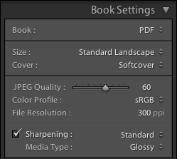
The Book Settings panel (configured for a PDF book) can be seen in the following picture:
 |
| PDF Book Settings |
In the Book field you can choose the book type you want to produce, and in this case it's PDF book. In the Size and Cover fields you can configure the physical layout of the book. In the current version, the following sizes are supported (which, incidentally, are the same sizes offered by Blurb):
- Small Square (7x7 in).
- Standard Portrait (8x10 in).
- Standard Landscape (10x8 in).
- Large Landscapes (13x11 in).
- Large Square (12x12 in).
Unfortunately, the PDF book type isn't as flexible as it should be since it only offers the same book formats (size and covers) available from Blurb. If you wanted to produce a book of another size, you couldn't do it using Lightroom.
As far as the covers are concerned, these are the available options:
- No Cover (Only available for PDF books).
- Hardcover Image Wrap.
- Hardcover Dust Jacket.
- Softcover.
Blurb Specific Options
If you're preparing a Blurb book, some Blurb-specific options will be available in the Book Settings panel, as you can see in the following picture. |
| Blurb Book Settings |
First of all, you can choose the paper type for your book. At the moment, the following options are available (further information can be found on the Blurb website):
- Premium Matte: 148 GSM paper.
- Premium Lustre: 148 GSM paper.
- ProLine Uncoated: 148 GSM paper.
- ProLine Pearl Photo: 190 GSM paper.
Interestingly, the cheapest Standard (118 GSM) paper isn't an available option. Since you cannot downgrade a book's paper using Blurb's web interface, if you want to print a book on standard paper using Blurb, you've got to make a PDF book and upload it to Blurb manually.
Personally, I don't appreciate this deliberate lack of choice. I admit I mostly use Premium paper for my books, but I don't like being forced to choose between uploading through the Book module and paying for a more expensive paper or going through the cumbersome process of uploading a PDF to Blurb manually.
Finally, you can choose whether you want your book to have a Blurb's logo page (the default option) or remove it from your book and pay the corresponding fee.
Setting the Image Quality
If you're producing a PDF book, you can choose a set of parameters that affect the quality of the images generated by Lightroom. If you're producing a Blurb book, you cannot modify the image quality (although it seems like Blurb is using 200 ppi sRGB images, which are good enough and match the resolution of their HP Indigo printers). The available configuration fields are the following:- JPEG Quality slider: to set the quality of the exported JPEG files.
- Color Profile: to set the color profile to use for the images. Available choices are: sRGB, Adobe RGB, Pro Photo RGB or a user-provided color profile.
- File Resolution: to set the resolution of the exported images.
- Sharpening: to set the amount of sharpening to apply to the images. Available choices are: Low, Standard and High.
- Media Type: to set the kind of media the book will be printed on. Available choices are: Matte and Glossy.
Automatic Layout
Once your book is configured, you can start laying out your images. Please take into account that modifying the book settings will result in Lightroom automatically laying out the images on the new page format. You should carefully review your book settings before proceeding to laying out your images if you don't want to lose your work.A good place to start is the Auto Layout panel. Instead of laying out all the images by hand, you can have Lightroom lay them out automatically using a specified preset and then apply the modification you require:
 |
| Auto Layout Panel |
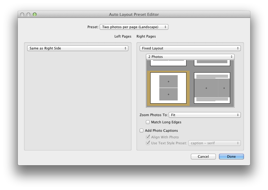
Fist of all, you've got to choose a page layout that Lightroom will use as a template for all the pages of the book. You can use an available preset or create one of your own. The bundled preset are designed to layout a single image on every page. If you want to modify an existing preset, or create a new one from scratch, you can choose Edit Auto Layout Preset… in the Preset list box and a configuration window will appear:
 |
| Auto Layout Preset Editor |
Using the Auto Layout Preset Editor, you can define the default layout used by Lightroom, specifying:
- A separate template for the left and right side pages. The templates can be chosen amongst the ones provided by Lightroom. Unfortunately, page templates themselves cannot be modified.
- The zoom level to be applied to the photos. Photos can be zoomed into place to either fit or fill their destination cell.
- Whether a caption should be added to each photo and some basic caption format settings.
Once the chosen preset has been set, you can press the Auto Layout button to have Lightroom create your book. In case you don't like the result and change your mind about the desired layout, you can use the Clear Layout button to clear the book and start again.
Laying Out the Images
No matter whether you're starting from scratch or from an automatically laid out book, you can layout your book simply dragging and dropping images into place. Depending on the layout of a page, you will see image placeholders, shown as grey cells, where you can drop an image: |
| Image Placeholders |
Once an image is dropped, its size can be changed using the zoom slider that appear above it. If it does not, just select the image by clicking on it:
 |
| Zooming an Image |
If you want to change the layout of a page, you can select it (clicking on the area just below it) and choose the desired layout in the Page panel or using the popup that can be accessed using the small black button on the bottom right corner of the page (visible on the previous image). Many available templates are available to place one, two, three or four image per page. Also, a great deal of creative templates are available in case you need to create more unconventional page layouts. Still, since page layouts cannot be customized, some users may find the available options insufficient.
An interesting layout featured by this module is the possibility of easily making two-page spreads like the one shown in the following image:
 |
| Two-Page Spread |
Customizing the Page
On the right side panel you will find some configuration options that allow you to tune your pages. Here's brief review of some of them.The Cell panel can be used to change an image padding:
 |
| Cell Panel |
Using the Amount slider, you can change the padding of the selected image cell. In the following image you can see the effect achieved applying a 60 points padding to a test image:
 |
| Padding on an Image Cell |
Since available page layout cannot be modified, you will find cell padding more useful than you may think at first sight.
The Caption panel lets you add captions to an image, to a page or to both of them:
 |
| Caption Panel |
Photo captions can be positioned above, over or below a photo and there can be one per photo. On the other hand, page captions can be positioned above, over or below a single page and there can only be one per page. In the following picture you can see an example of both a photo and a page caption:
 |
| Photo and Page Captions |
The text of either caption can be formatted using the tools available on the Type panel, a pretty basic text formatting tool that needs to be enhanced:
 |
| Type Panel |
Page Background
You can change the default white background of a page using the Background panel. You can set either a solid color or a background image (some of which are bundled with Lightroom): |
| Solid Black Background |
 |
| Graphic Background |
Saving Your Book
To save a book as a specialized Lightroom collection, just use the Book/Create Saved Book menu item (or the Command-S shortcut if you're on a Mac). Lightroom will show the Create Book window where you can customize the collection to be created: |
| Create Book |
Besides common collection attributes such as name and placement, there are specific book options that are pretty handy:
- Include only used photos instructs Lightroom to create a new book collection including only the photos that are actually placed on a page. Any other existing image in the source collection won't be included in the newly created one.
- Make new virtual copies instructs Lightroom to create a new virtual copy of every image included in the book collection. This option is useful if you want to isolate the changes you will apply to book images to the newly created virtual copies, instead of having them propagated to the source image.
Publishing Your Book
Once your book is finally complete, it's time to publish it. To export a book to PDF, just use the Export Book to PDF… button:- If your book is a PDF book, this button can be found at the bottom of the right side panel.
- If your book is a Blurb book, you can still export it as a PDF, but the button will be located at the bottom of the left side panel.
If, on the other hand, you want to publish a Blurb book and send it for printing, you've got to use the Send Book to Blurb… button located at the bottom of the right side panel.
Conclusion
Lightroom's Book module is an easy to use, yet powerful tool that lets you easily create and publish photo books. I'm sure that many amateur photographers will appreciate it since it fills a long standing gap with other tools (such as iPhoto or Aperture), even less sophisticated than Lightroom, that have been providing such feature for a long time.Moreover, and more importantly, this module is well integrated into Lightroom and you will continue to benefit from its the goodies without any disruption to your workflow. While it's true that it's not very flexible, even less than the original tool it's derived from (Blurb BookSmart), it has the great advantage of being an integral part of Lightroom and your productivity will surely benefit from it. Should you need a more complex tool, you could switch to a fully fledged desktop publishing solution (such as Adobe InDesign).
If you want to help me keep on writing this blog, buy your Adobe Photoshop licenses at the best price on Amazon using the links below.
Sunday, March 4, 2012
Adobe Lightroom Tutorial - Part XX - Exposure vs. Brightness
Part I - Index and Introduction
Part XXI - Making Photo Books
One of the questions I'm most frequently asked for by both blog readers and friends is:
The answer to this will soon be irrelevant: the Brightness slider has been removed from the new development process (2012) shipped with the upcoming release of Adobe Lightroom. I quickly described some of the changes that we'll see in Lightroom 4 on a previous blog post and I described the major differences between the current development process and the new one. Also, I stated I'm really glad that both the Exposure and the Brightness tools have been merged into a new tool, still called Exposure, whose behaviour I find more intuitive and predictable.
However, here's a quick summary of the major differences between Exposure and Brightness in Lightroom and how you could take advantage of both to improve your results.
First of all, let's have a look at the authoritative "answer", although not satisfactory, that comes directly from Adobe. The Lightroom 3 official documentation, that you can find here, states the following (this is an excerpt):
Lightroom documentation also suggests you adjust the overall tonal scale before adjusting the brightness.
Information provided by the documentation is crystal clear, but clearly insufficient. Although hinting at a major difference in how they alter the tonal scale of a picture, it fails to explains the real difference between them, leaving Lightroom users experimenting and trying to learn by trial and error. Furthermore, but this is just a personal opinion, the documentation only tells an half-truth. Based on my experience, in fact, the description is both incomplete and deceiving. In the following sections we'll see why.
In this blog post I'll use the following photo (unedited) as a test bench:
Let's begin increasing either adjustment:
The effect of the exposure increase on the image is greater than the effect of the corresponding brightness increase throughout the range.
The first thing we notice is something we already knew: as I've often stated in this blog, exposure is much less forgiving than brightness and burns the highlights very quickly. In fact, both zone VIII and zone IX are burned when increasing exposure by 2. On the other hand, increasing brightness has a much gentler effect on the highlight: in fact, no zone is yet burned out.
If you push these adjustments further, this behaviour is even more evident:
After increasing exposure by 3 steps, Zone from VI to IX are completely blown out. On the other hand, when increasing brightness to 150, zone IX is burnt (and zone VIII is very close to being so).
A similar behaviour can be observed when reducing a negative adjustment with these tools:
When decreasing their value, the effect of a brightness reduction is now greater than the effect of the corresponding exposure reduction. Once more, the overall effect of a brightness adjustment throughout the range is gentler and more uniform than the effect of an exposure adjustment. Also, a brightness reduction has a stronger effect on the shadows than an exposure one although, in this case, no zone has gone into zone 0 (pure black).
We can draw the following conclusions:
This basically mean, also, that the effect of either tool is not linear throughout the range, peaking at a specific value: the shadows, when increasing their value, or the highlights, when decreasing it. However, the overall effect of a brightness increase is more gentle and uniform throughout the dynamic range.
This asymmetric behaviour has interesting consequences that, once understood, can be incorporated into your workflow to improve your results:
Using this asymmetry at your advantage may signify improving the tone distribution of your image, especially when you want to push back the highlights towards the middle tones while retaining all of your shadow details and, on at the same time, preserving the natural look of your image.
Clearly, the sky and the colour of the rock deceived the camera and the resulting image is pretty overexposed. If we try to fix this picture using only the exposure slider, using the church as a reference, an acceptable result could be the following:
Not bad, but I'm not satisfied with the tone of the shadows nor with the overall tone distribution. This is a consequence of how exposure works: decreasing exposure has a stronger effect on the highlights, but the effect throughout the range is less uniform than brightness' (as seen in the previous zones samples).
Let's try to reduce the highlights bringing brightness down:
Please beware that, at least when processing Nikon RAW files (NEF), the default Brightness value is 50, not 0. As a result, the brightness value of the previous picture has been decrease by -60. The result is much more satisfactory, as far as it concerns overall tone distribution.
Starting from this picture, we can further tweak it until we're happy with the result. In this case, I'd just apply a small exposure adjustment to bring some light back into the shadow range:
The following picture suffers from the same problem:
Trying to bring the rocky cross and the church into a satisfactory range using exposure gives this result:
Once again, the result is somewhat flat and the tone distribution doesn't feel natural. Using both brightness (to reduce the highlights) and exposure, we obtain:
Look at the much more natural color of the rock: this is a much better starting point for further processing.
When working in the digital domain, tools may be less forgiving than film and paper are, since clipping is a phenomenon that occurs abruptly. Hopefully, this problem will be partially mitigated in Lightroom 4 but, in the meanwhile, we've got to live with it.
One of the problem that may arise when clipping a channel is color shift: when a channel fills up, the relative proportions among the channels cannot be respected and the hue of some colors may begin to drift.
That's the reason why I never push any tool any further when a channel start to clip. If I need further tonal adjustment, I'd rather use the curves instead, leaving the white point fixed.
Unexpectedly, color shift is another reason why you should consider brightness over exposure. This is a reference image I'll use to explain this problem:
This color reference chart is made up of three rows, each of which contain:
This is what happens when increasing either exposure and brightness over a certain level:
It's evident that exposure and brightness treat distinct RGB channels in a different way. With a 1.5 exposure adjustment, you can clearly see a color shift. Indeed, if you take a measurement of the darkest squares, corresponding to pure RGB colors, you get:
If, on one hand, the exposure behavior may be justified, on the other hand you should be warned that strong exposure adjustment may lead to undesired color shifts.
As we've seen, using one or the other may lead to very different results and even to unexpected (and undocumented) problems such as color shift.
If you want to help me keep on writing this blog, buy your Adobe Photoshop licenses at the best price on Amazon using the links below.
Part XXI - Making Photo Books
One of the questions I'm most frequently asked for by both blog readers and friends is:
"What's the real difference between Exposure and Brightness."
The answer to this will soon be irrelevant: the Brightness slider has been removed from the new development process (2012) shipped with the upcoming release of Adobe Lightroom. I quickly described some of the changes that we'll see in Lightroom 4 on a previous blog post and I described the major differences between the current development process and the new one. Also, I stated I'm really glad that both the Exposure and the Brightness tools have been merged into a new tool, still called Exposure, whose behaviour I find more intuitive and predictable.
However, here's a quick summary of the major differences between Exposure and Brightness in Lightroom and how you could take advantage of both to improve your results.
First of all, let's have a look at the authoritative "answer", although not satisfactory, that comes directly from Adobe. The Lightroom 3 official documentation, that you can find here, states the following (this is an excerpt):
- Exposure: Sets the overall image brightness, with a greater effect in the high values.
- Brightness: Adjust image brightness, mainly affecting midtones.
Lightroom documentation also suggests you adjust the overall tonal scale before adjusting the brightness.
Information provided by the documentation is crystal clear, but clearly insufficient. Although hinting at a major difference in how they alter the tonal scale of a picture, it fails to explains the real difference between them, leaving Lightroom users experimenting and trying to learn by trial and error. Furthermore, but this is just a personal opinion, the documentation only tells an half-truth. Based on my experience, in fact, the description is both incomplete and deceiving. In the following sections we'll see why.
In this blog post I'll use the following photo (unedited) as a test bench:
 |
| Grey Gradient - From Zone IX to Zone 0 |
Exposure and Brightness Behaviour
For small adjustments, both exposure and brightness will produce very similar results: you will begin seeing some differences when you push these sliders farther, on either end.Let's begin increasing either adjustment:
 |
| Exposure: +2 |
 |
| Brightness: +100 |
The effect of the exposure increase on the image is greater than the effect of the corresponding brightness increase throughout the range.
The first thing we notice is something we already knew: as I've often stated in this blog, exposure is much less forgiving than brightness and burns the highlights very quickly. In fact, both zone VIII and zone IX are burned when increasing exposure by 2. On the other hand, increasing brightness has a much gentler effect on the highlight: in fact, no zone is yet burned out.
If you push these adjustments further, this behaviour is even more evident:
 |
| Exposure: +3 |
 |
| Brightness: +150 |
After increasing exposure by 3 steps, Zone from VI to IX are completely blown out. On the other hand, when increasing brightness to 150, zone IX is burnt (and zone VIII is very close to being so).
A similar behaviour can be observed when reducing a negative adjustment with these tools:
 |
| Exposure: -3 |
 |
| Brightness: -150 |
When decreasing their value, the effect of a brightness reduction is now greater than the effect of the corresponding exposure reduction. Once more, the overall effect of a brightness adjustment throughout the range is gentler and more uniform than the effect of an exposure adjustment. Also, a brightness reduction has a stronger effect on the shadows than an exposure one although, in this case, no zone has gone into zone 0 (pure black).
We can draw the following conclusions:
- The overall effect of a brightness adjustment is gentler and more uniform throughout the dynamic range in both directions.
- Increasing the value of either tool has a stronger effect on the shadows.
- Decreasing the value of either tool has a stronger effect on the highlights.
- Increasing exposure quickly burns the highlights and has a stronger effect throughout the range.
- Decreasing brightness has a stronger effect throughout the range.
This basically mean, also, that the effect of either tool is not linear throughout the range, peaking at a specific value: the shadows, when increasing their value, or the highlights, when decreasing it. However, the overall effect of a brightness increase is more gentle and uniform throughout the dynamic range.
This asymmetric behaviour has interesting consequences that, once understood, can be incorporated into your workflow to improve your results:
- If you need to reduce the highlights of a picture (relatively to other ranges), you should consider reducing the brightness.
- If you need to increase the shadows of a picture (relatively to other ranges), you should consider increasing the exposure.
Using this asymmetry at your advantage may signify improving the tone distribution of your image, especially when you want to push back the highlights towards the middle tones while retaining all of your shadow details and, on at the same time, preserving the natural look of your image.
Some Example Pictures
I took this picture on the Roman Bridge in Salamanca using matrix metering and no exposure compensation: |
| Original Image - Matrix Metering - Exposure Compensation: 0 EV |
Clearly, the sky and the colour of the rock deceived the camera and the resulting image is pretty overexposed. If we try to fix this picture using only the exposure slider, using the church as a reference, an acceptable result could be the following:
 |
| Exposure: -1 |
Not bad, but I'm not satisfied with the tone of the shadows nor with the overall tone distribution. This is a consequence of how exposure works: decreasing exposure has a stronger effect on the highlights, but the effect throughout the range is less uniform than brightness' (as seen in the previous zones samples).
Let's try to reduce the highlights bringing brightness down:
 |
| Brightness: -10 |
Please beware that, at least when processing Nikon RAW files (NEF), the default Brightness value is 50, not 0. As a result, the brightness value of the previous picture has been decrease by -60. The result is much more satisfactory, as far as it concerns overall tone distribution.
Starting from this picture, we can further tweak it until we're happy with the result. In this case, I'd just apply a small exposure adjustment to bring some light back into the shadow range:
 |
| Exposure: +0.1 - Brightness: -10 |
The following picture suffers from the same problem:
 |
| Original Image - Overexposed |
Trying to bring the rocky cross and the church into a satisfactory range using exposure gives this result:
 |
| Exposure: -1 |
Once again, the result is somewhat flat and the tone distribution doesn't feel natural. Using both brightness (to reduce the highlights) and exposure, we obtain:
 |
| Exposure: -0.2 - Brightness: 0 |
Look at the much more natural color of the rock: this is a much better starting point for further processing.
Clipping and Color Shift
One of the the issues a photographer is always struggling with is clipping and all its incarnations. This is true both on camera and in post production. The exposure sliders in the current Lightroom development process (2010, in Lightroom 3), is the risk of clipping some channel when increasing its value.When working in the digital domain, tools may be less forgiving than film and paper are, since clipping is a phenomenon that occurs abruptly. Hopefully, this problem will be partially mitigated in Lightroom 4 but, in the meanwhile, we've got to live with it.
One of the problem that may arise when clipping a channel is color shift: when a channel fills up, the relative proportions among the channels cannot be respected and the hue of some colors may begin to drift.
That's the reason why I never push any tool any further when a channel start to clip. If I need further tonal adjustment, I'd rather use the curves instead, leaving the white point fixed.
Unexpectedly, color shift is another reason why you should consider brightness over exposure. This is a reference image I'll use to explain this problem:
 |
| Color Reference Chart |
This color reference chart is made up of three rows, each of which contain:
- A pure RGB color in the first square.
- Two differently saturated versions of the same color on the remaining two squares.
This is what happens when increasing either exposure and brightness over a certain level:
 |
| Exposure: +1.5 |
 |
| Brightness: +150 |
It's evident that exposure and brightness treat distinct RGB channels in a different way. With a 1.5 exposure adjustment, you can clearly see a color shift. Indeed, if you take a measurement of the darkest squares, corresponding to pure RGB colors, you get:
- Red: (220, 61, 68)
- Green: (221, 255, 160)
- Blue: (125, 76, 255)
- Red: (223, 91, 96)
- Green: (223, 255, 211)
- Blue: (122, 122, 255)
If, on one hand, the exposure behavior may be justified, on the other hand you should be warned that strong exposure adjustment may lead to undesired color shifts.
Conclusion
Although similar, exposure and brightness have got completely different behaviour throughout the tonal range. Learning to use them is critical to master Lightroom and get the best out of your pictures. Also, every picture is unique and there's no rule but your personal taste when deciding which adjustments to apply in post production.As we've seen, using one or the other may lead to very different results and even to unexpected (and undocumented) problems such as color shift.
If you want to help me keep on writing this blog, buy your Adobe Photoshop licenses at the best price on Amazon using the links below.
Thursday, March 1, 2012
Adobe Photoshop Lightroom Tutorial - Part XIX - Graduated Filters
Part I - Index and Introduction
Part XX - Exposure vs. Brightness
The second Lightroom tool I'd like to talk about is the graduated filter.
Physical graduated filters are devices commonly used by photographers, usually to darken the filtered parts of an image whose luminance level wouldn't otherwise fall into the dynamic range of the film or the sensor.
Adobe Lightroom brings the same concept into the post-production domain and further enhances it. Lightroom's graduated filters are fully configurable and let you apply different kinds of adjustments:
Furthermore, they allow you to apply both positive and negative adjustments, contrary to what can usually be done with physical graduated filters which can only darken the filtered image.
To add a graduated filter to an image, or modify an existing one, you can use one of the following techniques:
The graduated filter panel will open as shown in the following screenshot.
In the upper part of the panel (called Mask) you can choose whether you're adding a new filter (New, the default choice when you open the panel) or if you want to modify an existing one (Edit). Graduated filters are fully configurable using the adjustment sliders you can find on the main panel window.
You don't need to always start a filter configuration from scratch, though. You can choose an existing filter from the Effect drop-down menu (Lightroom bundles some of them) and even create your own saving the current configuration of a filter into a new preset, using the Save the current settings as a new preset menu item. That's a pretty handy feature if you use similar settings over and over again.
Also, since you will often need to fine tune the filter settings after applying it, you can safely add a configured filter, check the results and fine tune its adjustments according to your needs.
The position of a filter just indicates where it's located on the image. Its "centre", indicated by the grey handle, is just a convenience for you to spot the existing filters on an image: as far as you move it along the filter axis (the middle line), the results won't change.
As most physical filters, a Lightroom's graduated filter applies effects whose intensity depends solely on the distance of a point from the filter axis (on other words, the intensity is the same along a line that is parallel to the filter axis). The inclination of the filter is the angle between its axis and the horizon and it's a critical parameter that determines how the chosen effect is applied to the image.
The width, determined by the distance between the filter axis and either of the other two lines that define the filter, is the width of the graduated zone of the filter. The larger the graduated zone, the softer the edges of the filter and the smoother degradation of the filter effect from one of its sides to the other.
In fact, a graduated filters applies its effect in three different ways on three different zones of the image that are determined by the its axis and its graduated zone of the filter. When you lie a filter on an image, its axis divides the image into two sides, that we will label inner and outer sides: the inner side is the side of the image that contains the point you started dragging the filter from, the other one being the outer. The filter behaviour outside the graduated zone is the following:
Similarly, you can modify the geometric characteristics of a filter by clicking and dragging:
In the following image, I used two graduated filters: the first one was used to slightly darken the exposure of the sky and give it a soft gradient, the other one to recover detail in the shadows that were projected over the square by the building behind me:
The first graduated filter is configured to increase the exposure by 1 f/stop and, as you can see in the following screenshot, its axis lays just along the border of the shadow and its graduated zone is very narrow.
The second graduated filter is configured to decrease the exposure of the sky only slightly, by approximately 1/3 f/stop and, as you can see in the following screenshot, its axis lays just along the border of the building in foreground and its graduated zone is very wide, so that the gradient in the sky is very smooth and soft.
The original picture without graduated filters is the following:
As you can, the underexposure of the shadows couldn't have been corrected using the tones controls: since their effect is global, shadows on the other parts of the image, such as the foreground building, would have been compromised.
Please notice that there are two color temperatures on the image: the temperature of the sunny part and the temperature of the shady part. On one hand, the graduated filter I used to raise the exposure of the shadows has emphasized the details on that part of the image. On the other hand, however, it has also accentuated the difference between the two different temperatures and now you can clearly see a blue dominant in it. This problem, before Lightroom 4 was available, could only be corrected using an external image editing program. Instead, Lightroom 4 allow us to apply non global color temperature adjustments by means of both graduated filters and adjustment brushes.
In this tutorial, we've explored how a graduated filter works and how it can be used to fix the exposure in part of an image. However, as stated in the previous sections, Lightroom will let you apply many kinds of adjustments through a graduated filter giving you a great flexibility when it comes to post processing your images.
In the cases in which a graduated filter isn't suitable, an adjustment brush can be used instead, as I will explain in the upcoming part of this tutorial.
If you want to help me keep on writing this blog, buy your Adobe Photoshop licenses at the best price on Amazon using the links below.
Part XX - Exposure vs. Brightness
The second Lightroom tool I'd like to talk about is the graduated filter.
Physical graduated filters are devices commonly used by photographers, usually to darken the filtered parts of an image whose luminance level wouldn't otherwise fall into the dynamic range of the film or the sensor.
Adobe Lightroom brings the same concept into the post-production domain and further enhances it. Lightroom's graduated filters are fully configurable and let you apply different kinds of adjustments:
- Color temperature and tint.
- Basic tone controls: Exposure, contrast, highlights and shadows.
- Clarity.
- Saturation.
- Sharpness.
- Noise.
- Moiré.
- Color.
Furthermore, they allow you to apply both positive and negative adjustments, contrary to what can usually be done with physical graduated filters which can only darken the filtered image.
To add a graduated filter to an image, or modify an existing one, you can use one of the following techniques:
- Select the Tools/Graduated Filter menu item.
- Select the graduated filter icon on the tool strip in the Develop module (described in the previous post).
- Use the 'M' keyboard shortcut.
The graduated filter panel will open as shown in the following screenshot.
 |
| Graduated Filter Panel |
In the upper part of the panel (called Mask) you can choose whether you're adding a new filter (New, the default choice when you open the panel) or if you want to modify an existing one (Edit). Graduated filters are fully configurable using the adjustment sliders you can find on the main panel window.
You don't need to always start a filter configuration from scratch, though. You can choose an existing filter from the Effect drop-down menu (Lightroom bundles some of them) and even create your own saving the current configuration of a filter into a new preset, using the Save the current settings as a new preset menu item. That's a pretty handy feature if you use similar settings over and over again.
Also, since you will often need to fine tune the filter settings after applying it, you can safely add a configured filter, check the results and fine tune its adjustments according to your needs.
How a Graduated Filter Works
A graduated filter is defined not only by its effect settings, but also by the following parameters:- Its position on the image and its inclination.
- Its direction, or its orientation.
- Its width.
 |
| Characteristics of a Graduated Filter |
The position of a filter just indicates where it's located on the image. Its "centre", indicated by the grey handle, is just a convenience for you to spot the existing filters on an image: as far as you move it along the filter axis (the middle line), the results won't change.
As most physical filters, a Lightroom's graduated filter applies effects whose intensity depends solely on the distance of a point from the filter axis (on other words, the intensity is the same along a line that is parallel to the filter axis). The inclination of the filter is the angle between its axis and the horizon and it's a critical parameter that determines how the chosen effect is applied to the image.
The width, determined by the distance between the filter axis and either of the other two lines that define the filter, is the width of the graduated zone of the filter. The larger the graduated zone, the softer the edges of the filter and the smoother degradation of the filter effect from one of its sides to the other.
In fact, a graduated filters applies its effect in three different ways on three different zones of the image that are determined by the its axis and its graduated zone of the filter. When you lie a filter on an image, its axis divides the image into two sides, that we will label inner and outer sides: the inner side is the side of the image that contains the point you started dragging the filter from, the other one being the outer. The filter behaviour outside the graduated zone is the following:
- In the inner side the effect is applied with full intensity. In the previous image, for example, this zone is identified by the blue arrow.
- In the outer side, the filter has no effect.
Modifying a Graduated Filter
Any parameter of an existing graduated filter can be modified. To select a filter to modify, you've got to perform the following operations:- Open the graduated filters panel as explained above.
- Select the filter you want to modify by clicking on its handle (the grey circle in its center).
- Apply any modification you want to the effect sliders.
- Its handle, if you want to move it.
- Its axis, if you want to rotate it.
- Its graduated zone boundaries, if you want to change its width.
Common Uses
Historically, physical graduated filters have been used to reduce the light intensity in selected parts of an image so that all of it falls into the dynamic range of the film or the sensor being used and avoid burning it out. A common case is using a filter to reduce the intensity of the light coming from the sky. Since data from a clipped channel cannot be recovered in post production, this type of filters is still widely used on camera. Nevertheless, it's often convenient to apply an exposure correction with a graduated filter in post production, provided your channel is not burnt out.In the following image, I used two graduated filters: the first one was used to slightly darken the exposure of the sky and give it a soft gradient, the other one to recover detail in the shadows that were projected over the square by the building behind me:
 |
| Final Image |
The first graduated filter is configured to increase the exposure by 1 f/stop and, as you can see in the following screenshot, its axis lays just along the border of the shadow and its graduated zone is very narrow.
 |
| Graduated Filter - Exposure: +1 |
The second graduated filter is configured to decrease the exposure of the sky only slightly, by approximately 1/3 f/stop and, as you can see in the following screenshot, its axis lays just along the border of the building in foreground and its graduated zone is very wide, so that the gradient in the sky is very smooth and soft.
 |
| Graduated Filter - Exposure: -0.3 |
The original picture without graduated filters is the following:
 |
| Original Image |
As you can, the underexposure of the shadows couldn't have been corrected using the tones controls: since their effect is global, shadows on the other parts of the image, such as the foreground building, would have been compromised.
Please notice that there are two color temperatures on the image: the temperature of the sunny part and the temperature of the shady part. On one hand, the graduated filter I used to raise the exposure of the shadows has emphasized the details on that part of the image. On the other hand, however, it has also accentuated the difference between the two different temperatures and now you can clearly see a blue dominant in it. This problem, before Lightroom 4 was available, could only be corrected using an external image editing program. Instead, Lightroom 4 allow us to apply non global color temperature adjustments by means of both graduated filters and adjustment brushes.
Conclusion
Graduated filters are a very convenient way to apply an effect to a section of an image whose boundary is a straight line, such as horizons, straight buildings, rectilinear shadows, and so on.In this tutorial, we've explored how a graduated filter works and how it can be used to fix the exposure in part of an image. However, as stated in the previous sections, Lightroom will let you apply many kinds of adjustments through a graduated filter giving you a great flexibility when it comes to post processing your images.
In the cases in which a graduated filter isn't suitable, an adjustment brush can be used instead, as I will explain in the upcoming part of this tutorial.
If you want to help me keep on writing this blog, buy your Adobe Photoshop licenses at the best price on Amazon using the links below.
Subscribe to:
Posts (Atom)