AdSense Mobile Ad

Thursday, January 19, 2012

Adobe Photoshop Lightroom 4: The New Development Process

Edited: This post was written few days after the release of Adobe Lightroom 4 Beta 1. Few days ago, the final release of Lightroom 4 has been shipped and, as expected, the new development process has suffered no changes.

A few days ago Adobe released the first beta preview of the upcoming release of Adobe Photoshop Lightroom 4. This Beta release introduces many new features and a new development process (2012).

The new development process is at least as intuitive as its predecessor, although it's been fundamentally redesigned. At first, it may seem pretty different, especially when you compare the result you obtain applying the "same" adjustment in the previous process (2010) and in the new one.

In fact, despite the need of getting used to the new tool, I believe that the new process is both more intuitive and more powerful.

Neutral Defaults

The first thing you'll notice when importing a photo into Lightroom 4 is that default settings are more neutral. Lightroom 3 defaults introduce a bit of contrast in two places:
  • The Blacks slider is set to 5, shifting down the black point a bit.
  • The tone curve is set to Medium Contrast.

While it's true that we're very often pushing the contrast a bit, I don't like Lightroom doing it for me during the import phase. In fact, I usually reset those settings either manually or with a preset just while importing. Lightroom 4, on the other hand, just lets your image untouched: the only setting that's still applied is the Adobe Standard profile in the Camera Calibration panel.

Although it may seem a minor problem, it also has a serious impact on the effect of other controls, such as the Exposure control, on Lightroom 3. This problem is not only evident on low key images, or images with dark shadows, but also on images whose exposure you need to increase more than a bit. Why? Because Blacks is used to set the black clipping point. When it's set, Lightroom will try to preserve it: if you shift rights or expand the histogram more than a bit, results may start to look unnatural.

Look at this image:

Underexposed Image

When I shot it, I voluntarily underexposed it: I had no tripod, the camera ISO was already set to maximum, but the shutter speed was too slow. After import Lightroom defaults were applied. Let's see what happens if I unnaturally raise the exposure:

Overexposed Image - Blacks: 5


As you can see, the results doesn't mimic an on-camera overexposure. Darks and shadows are simply too dark. Part of this problem is how the Exposure control works in Lightroom 3 (it's significantly improved in Lightroom 4), but part of it is also the default Blacks settings. If you just set it to 0, here's the result:

Overexposed Image - Blacks: 0

The result is certainly more similar to what you'd expect. Keep in mind that this seriously underexposed image is used as an example, but you may experience similar problems with any sort of image with strong shadows, such as portraits of dark haired people or high contrast images such as the following:

High Contrast Image

I shoot RAW because I want to have full control and good working margins in post production. You'd better get used starting with neutral defaults rather than using a default contrast level, although moderate, introduced by Lightroom. In many cases, the default black clipping point is simply too much.

Development Process

As we've seen, Lightroom 4 uses more neutral defaults which, in my opinion, are a better starting point when you develop your images. Furthermore, the Lightroom 4 development process has been redesigned and, as a result, the control you've got on the tones of the image has been vastly improved.

Here's the Basic panel in Lightroom 3, showing the tools available in the 2010 development process whose functionality has been detailed in my Lightroom Tutorial:

Lightroom 3 - Basic Panel

On the other hand, here's the new Lightroom 4 Basic panel:

Lightroom 4 - Basic Panel

As you can see, in Lightroom 3, the tonal range is divided into 4 segments (Exposure, Recovery, Fill Lights and Blacks), while in Lightroom 4 it's divided into 5 (Exposure, Highlights, Shadows, Whites, Blacks). The differences, however, are much deeper and the way those sliders work has changed substantially.

Exposure

In Lightroom 3, the Exposure slider was used to control the overall exposure of the image but it had a major drawback: it ungracefully clipped the highlights. Here's what happens when raising the Exposure to +4 to the previous image:

Lightroom 3 - Exposure: +4

As you can see, highlights are completely blown up.

This is why a Brightness adjustment was available in Lightroom 3. Brightness modifies the exposure on the middle tones, without shifting (at least too much) the black and the white point. In Lightroom 3, tweaking the exposure could be tricky:
  • You would use the Exposure adjustment to set the overall exposure level, paying attention not to clip the whites too much.
  • You would use the Recovery adjustment to recover blown up details, if necessary.
  • You would use the Brightness slider to fix the exposure without affecting the white point.

Not difficult but time consuming. Also, images with strong highlights were even trickier to fix:
  • You cannot push Exposure too much, because you would clip the whites.
  • You could use Brightness, but it isn't effective on the shadows.
  • You could use Fill Lights to correct the exposure on the shadows, but large adjustments would shift up all of the histogram too, making it difficult to keep overall exposure under control.

In either case, the overall tones of the image would suffer, and you could end up with unnatural feelings or artificial-looking low contrast images. In my opinion, all the problems originate in how the basic tone adjustments end up affecting all of the histogram (with notable exception, such as Recovery).

Lightroom 4 has greatly improved these controls and now fixing the tones of your images is easier then ever. As you've surely noticed, the Brightness adjustment has disappeared. Indeed, the Exposure adjustment behaviour has changed dramatically: it now affects the middle tones with much less effect on blacks and whites. On the following image you can see which part of the histogram is mainly affected by the Exposure adjustment:
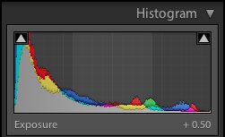
Lightroom 4 - Exposure

In fact, it falls off much more gracefully on either end of the histogram, mimicking the graceful degradation of film, rather than the abrupt clippings we experience with digital sensors. Here's the same image with a similar (excessive) Exposure adjustment:

Lightroom 4 - Exposure: +4

Much better. This way, applying an overall exposure adjustment as a starting point is much easier than before.

In this case, for example, a +.50 adjustment is a perfect starting point to develop this image, without worrying about blacks (yet):

Lightroom 4 - Exposure: +.50

Highlights and Shadows

As we've seen in the previous section, the Exposure adjustment now mainly affects middle tones, the central section of the histogram. In Lightroom 3, Exposure also affected a higher part of the histogram: this part is now more finely controlled by the Highlights adjustment:
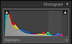
Lightroom 4 - Highlights

Pretty much symmetrically, Lightroom 4 introduced another adjustment, called Shadows, to control the lower tones of the histogram:
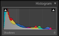
Lightroom 4 - Shadows

You may think that Shadows is the equivalent of the legacy Fill Lights. It certainly is, if you only consider the tones it controls. But this is not only a mere name change, though. As we've seen with Exposure, in Lightroom 4 each tone adjustment affects contiguous tones to a lesser extent. This is very important, as you can now adjust different tones without a great impact on the all image.

Let's see what happens in Lightroom 3 if you raise the Fill Lights adjustment:

Lightroom 3 - Fill Lights: +80

Once more, this is an example meant to understand Lightroom's behaviour. Nonetheless, that's what happens if you push shadows too high in Lightroom 3. To tweak them correctly, you sometimes have to rely on local adjustments (with a brush) or, if possible, a careful and time-consuming adjustment of the entire tone curve. In fact, Fill Lights shifts the entire histogram up and down:
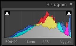
Lightroom 3 - Fill Lights: +80

Lightroom 4, on the other hand, applies a much more limited adjustment:

Lightroom 4 - Shadows: +100

The result is much more natural and, above all, predictable. Look at the resulting histogram, you can see how Shadows, although pushed up to the maximum value, has modified the histogram locally:
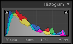
Lightroom 4 - Shadows: +100

As we go discovering the tone controls, we see that it's easier to get to the result we've got in mind using Lightroom 4 rather than Lightroom 3. In this case, I think an adjustment of Shadows +42 is what I'm looking for:

Lightroom 4 - Shadows: +42

Whites and Blacks

The last two tones adjustments, certainly not surprisingly, affects the lower and higher ends of the histogram and are basically used to set the white and the black point. Lightroom 3 only had an adjustment to set the black point (Blacks) and you had to set the white point using other controls (usually Exposure or a combination of Exposure and Recovery).

Lightroom 4 makes life easier (once more), and provide two separate controls to set your image clipping points: Whites and Blacks. In this case, once again, this controls affect a limited range of tones in the histogram and won't have a great impact on the overall tone range. As a result, these adjustment are more predictable and easier to use.

The behaviour of the Blacks adjustment in Lightroom 3, as you can see, was greater and spanned the overall histogram, even for moderate values:

Lightroom 3 - Blacks: +50

Please note how the histogram has been shifted down entirely:
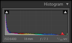
Lightroom 3 - Blacks: +50

In Lightroom 4, on the other hand, the Blacks adjustment has a more limited and more local effect, even at maximum value:

Lightroom 4 - Blacks: +100

Look at the brightest parts of the image, such as the reflections on the water or the sky. That's the effect of not shifting down the entire histogram so much as Lightroom 3 did:
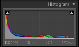
Lightroom 4 - Blacks: +100

The same thing happens with the Whites:

Lightroom 4 - Whites: +50

Lightroom 4 - Whites: +50

Adjusting the brightest parts of the image (the reflection of the lights) to make them brighter is very easy, without modifying the other tones. In Lightroom 3, this wasn't possible unless modifying the Exposure (and thus, the entire histogram), or modifying the tone curve.

Clarity

The Clarity adjustment has undergone a serious revision in Lightroom 4. It's now much more powerful and you can estimate using half the value you were using in Lightroom 3 to get pretty much the same effect.

Clarity is used to modify local contrast. This adjustment is very handy and potentially save many roundtrips from Lightroom to Photoshop during your workflow. However, I think that positive Clarity in Lightroom 3 had too much a weak effect in certain circumstances and I had to edit the image in Photoshop. Moreover, halos would appear very soon raising Clarity, and that's another issue that makes me open Photoshop more often than I'd like.

Both issue have been solved and Clarity works much better than ever in Lightroom 4.

This is an extreme example, but here's the result of applying maximum Clarity in both Lightroom 3 and 4:

Lightroom 3 - Clarity: +100

Lightroom 4 - Clarity: +100

It's too much for that image, I agree. But if you consider that you can locally brush in Clarity, this should give you an idea of the flexibility you can get from this improved adjustment.

Conclusion

So much for this post. We've seen how the new development process in Lightroom 4 is easier to grasp, easier to use and more predictable. Sure, we've got to "forget" about the old one and learn a new one from scratch. However, I think that the improvements are really worth this effort and I'm convinced that your effectiveness will improve dramatically.

Although out of scope in this post, here are other interesting new features and improvements that we will likely see in the upcoming Lightroom 4:
  • New Map module to manage geolocation data.
  • New Book module to make photo books.
  • New and improved local adjustment such as: Temperature and Tint and Noise reduction. 

If you haven't done it yet, go to Adobe Labs, download and test drive Lightroom 4. I'm sure you'll be positively surprised.

If you want to help me keep on writing this blog, buy your Adobe Photoshop licenses at the best price on Amazon using the links below.

Tuesday, January 17, 2012

Angle of View and Focal Length: A Rule of Thumb for a Quick Estimation

Nowadays there are plenty of zooms lenses for any budget and many photographers aren't using big lens bags any longer. In fact, some lenses such as the Nikkon 18-200mm (in its various incarnation) are jack-of-all-trades that satisfy the needs of many photographers out there.

However, there's people who prefer carrying more lenses of different focal lengths and, possibly, better optical quality. I'm one of them. I'm not implying that the 18-200mm is a bad lens: it isn't. I simply made other choices.

Be it as it may, the point of this post is the following: you're framing a picture with your camera and you realize you need a longer lens to get the shot you've got in mind. The question is: Which focal length do I need?

More often than not, you're not carrying many lenses and the answer may be simple: the one you've got. Sometimes the estimate is easy, sometimes it is not. Imagine you're framing the shot with a 35mm and you deem it insufficient. Would a 100mm do the job? Or a 200mm? And what about a 300mm?

Other times you cannot even decide by trial and error: you haven't got any more lenses and you want to buy one. But you want to be sure beforehand.

You've probably experienced such a doubt. A common situation amongst novices with a telephoto lens is shooting the moon. You take your brand new 200mm lens (or whatever) and you frame the moon only to realize that your lens is way too short to get the amazing picture of the moon you wanted to take.

What focal length do I need?

Tradeoffs

Before getting deeper into the subject, let me tell you about some tradeoffs. They're obvious, but many people seem to miss them anyway:
  • Zoom with your feet.
  • Crop.

Zoom With Your Feet
The first advice I can give you is: zoom with your feet. This is the best tradeoff since it's got many advantages. Focal length is just one of the parameters and, sometimes, long lenses may prevent you from doing what a good photographer should do: walk around your subject, look for a good or an unusual point of view, change perspective and so on. The lens is a tool, it's up to you deciding how to use it.

There are times, however, when you can't get closer to your subject. There's no way to get closer to the moon on foot. There are ways to get closer to a leopard in the wild, but you aren't going to do it either. Other times you don't want a bird to see you and fly away. In this case, you do need a longer lens.

How long? Read on.

Crop
Nobody likes cropping: you've spent money on a good sensor and you want to squeeze any possible detail from it. I agree. However, it's better to crop a shot rather than lose it anyway. How much crop you can afford depends on what's the purpose of the image. If you just need a decent print, you can calculate beforehand how much crop you're willing to trade in for a better composition.

A 16 megapixel sensor, for example, gives an image almost 5000 pixels wide and more than 3000 pixel high (landscape frame). If you're going to print such image at 300 dpi, you're going to get approximately a 16" x 10" picture (42 cm x 27 cm). It's big, isn't it? If you crop it to half of its size, you're left with enough resolution to get a 8" x 5" picture (21 cm x 13.5 cm). Big enough for many uses.

Obviously, details aren't going to be as sharp as on the original image but it can be enough.

Look at this picture of the moon, for example:

200mm - Cropped to 2500x1600 pixels

It was taken using a 200mm lens and cropped down to approximately 2500x1600 pixels (scaled down further for inclusion in this blog).

It's not state of the art but still, some details of the craters are still visible.

However, this image, as whichever image you see in your viewfinder, can help you estimate the focal length you need to get the picture you'd like.

Angle of View

Here's some theory to answer this question. The angle of view can be calculated easily using the sensor (or film) size, the focal length of the lens and the distance to the subject. Since we're talking about telephoto lenses, we'll use a simpler model that simplifies a bit the maths and the resulting formula assuming that you're focusing at infinity (or sufficiently far away). This assumption holds in this case: we're talking about getting closer, hence it's safe to assume that we're pretty far away.

The maths tells us that the angle of view a of a given lens/sensor pair is:


where d is the sensor size and f is the focal length. The angle you're measuring (horizontal, vertical or diagonal) depends on how you measure the sensor size (horizontally, vertically or diagonally). As far as it concerns our estimation and the rule of thumb, it doesn't really matter.

Estimating the Required Focal Length

The previous formula tells us everything, doesn't it? Probably no, in fact, I admit it. We're photographers, not mathematicians. But a very useful rule of thumb comes directly from the properties of the previous equation. Let's plot it from 18mm to 600mm, using a sensor size of 23mm (the sensor size, as I told you, doesn't matter very much since it's effect is just stretching or expanding the function graph):

Angle of view from 18mm to 600mm

Let's ignore the y dimension and just focus on its shape. What can we infer? The shortest the focal length you're using (the closer you are to the origin), the steeper the curve. This is something you probably have observed when you zoom in with you telephoto lens: at the beginning, the effect of getting closer is more pronounced, and it slows down as you open your lens. Look how the angle gets smaller and smaller when zooming further at bigger focal length (arrows indicate the size of the angle of view reduction in focal length increments of 100mm, except the first one that is calculated from f=50mm approximately):

d(Angle of View)/d(focal length)

Ok, we knew that. What's next? This observation: look at the angle of view delta when scaling the focal length with a fixed multiplier. Let's use 2: the difference between 50, 100, 200 and 400 is very similar. Why? Once more, is a mathematical property of the arctan function. The plot of the arctan function is the following:

arctan(x), with x in [-2,2]

In the angle of view equation, f it's in the denominator: this means that when f increases, the arctan argument actually decreases. Look at the plot: if you consider an interval sufficiently near the origin, it very much resembles a line.

That's the trick in our rule of thumb! We're going to approximate the arctan function near the origin with the line y = x. Can we do it? Sure. Take a sensor size of d = 23mm. We're not interested in wider lenses, but even if we were, d/(2f) with f = 18mm gives 0.6. Pretty much into the linear zone of the function anyway. Here's the rule:

We can approximately affirm that, for sufficiently long lenses, multiplying the focal length by a factor of c reduces the angle of view by the same factor.

This is very handy, since you need to take no measurement. Just look into the viewfinder: want a moon twice as big? You need a focal length twice as big.

An Example

Take a look at the previous picture of the moon:

200mm - Cropped to 2500x1600 pixels (half the original width)

The moon size is approximately a quarter of the picture height. If I wanted to fill the frame, our rule of thumb tells us that I'd need approximately a 200mm · 4 = 800mm lens.

But the previous image is a crop: the original image is twice the size. That gives 1600mm, if I wanted to fill that frame.

Big bucks for the moon picture.

Next time you plan to buy a longer lens, frame a picture with your telephoto and use this rule.

P.S.: Plots were generated using the excellent Wolfram Alpha web application.

Sunday, January 15, 2012

Nikon D5100 vs. Nikon D7000: My First Impressions

I've been a happy owner of a Nikon D5100 for almost a year. Until last week. I decided to switch to the Nikon D7000 and, after just a few days, I'm compelled to write this blog post for others not to make my "mistake" and take an informed decision.

I want to be clear: the Nikon D5100 is an excellent DSLR camera for amateurs, and I'm sure it's a perfect choice for many amateurs photographers out there. In fact, it shares many important things with the D7000, its bigger sister: the very sensor itself and the image processor. As far as it concerns the image quality you're going to squeeze out of them, they're almost on par: the D7100 has a slightly wider dynamic range (13.9 EV vs 13.6 EV, a 2.2% difference) but so far I haven't succeeded in appreciating the difference.

Many differences between the two cameras are subtle, and many additional features you can find on the D7000 may be of no interest to you, such as the compatibility with older lenses without autofocus motor. On the contrary, some features of the D5100 that aren't available on the D7000 may be valuable to you: on-camera HDR, for example, is a big advantage if you want to shoot HDR photos without the hassle of a complex post-production workflow. I don't shoot HDR, but I recognize that many people do or may be interested in doing so.

If you're wondering about the differences, just Google for it: it's a hot topic. This post, for example, is an extensive yet very well summarized comparison table.

Why, then, did I decide to change it so soon? Basically, for a couple of reasons that are very important to me.

Ergonomics and Ease of Use (If You Shoot in Full Manual Mode)

I knew it, but I didn't bother investigating any further. And it was a major error. Ergonomics is important, as well as the organization of the camera controls, especially when it impairs the ability of shooting as quick as you'd like. I'm not a pro, but I'm an amateur that very often shoots in full manual mode. And when I'm not, I'm using Aperture priority mode and, in either case, I often need to tweak the camera settings from one shoot to another. The D5100 falls a bit short on this side and that's just where the D7000 shines.

Basically, when shooting with the D7000, I'm almost never entering the camera menu: just a "flick of a switch" and I'm done. The D7000 lets you change many parameters just using buttons and command dials, including the following:
  • Exposure compensation.
  • Flash compensation.
  • Release mode.
  • Metering mode.
  • Autofocus mode and autofocus area mode.
  • ISO sensitivity.
  • White balance.

The settings that are quickly accessible from a combination of a button and a dial are the great majority you usually need. Moreover, the D7000 offers two additional mechanisms to quickly speed up the camera tuning:
  • Two user modes (U1 and U2), that let you save entire banks of camera settings and just recall them using the mode dial.
  • My Menu: you can build a custom menu and populate it with your favorite menu settings.
That's almost everything I need when shooting outside a controlled environment. The ergonomics is very well thought of: you quickly get used to the camera buttons and their position and in no time you find yourself tweaking many parameters without leaving the viewfinder. That's a major win against the D5100, for which you've got to resort to the camera menu for many of those parameters.

With the D5100 I lost some shots because I hadn't got sufficient time to setup the camera. With the D7000, this problem is greatly mitigated. And your subjects won't get bored when you fiddle with your camera, staring at its screen.

The possibility of customising the behaviour of many D7000 buttons and the availability of two additional buttons on the front side of the camera (the function button and the preview button) provide additional flexibility to your setups. I almost exclusively use the AF-ON technique and, since neither camera provide a dedicated AF-ON button, I have to assign this function to another one (the AE-L/AF-L button). Even if I could do that on the D5100 (and you cannot), you would simply run out of programmable buttons. The D7000, on the other hand, lets you assign AF-ON to the AE-L/AF-L button and gives you the possibility of assigning the other two buttons to functions you may need during your shooting session, such as quick switching to spot metering or flash-value lock.

Focus

My first impressions confirms that the D7000 focus system is way ahead, when compared to the D5100's one. First of all, the D7000 offers 39 focus points, 9 of which are cross-type, against the 11 ones offered by the D5100, of which only 1 is cross-type. But the number of focus points isn't just the only important metric. I tried, although not yet thoroughly, to compare the behaviour of the two focus systems when tracking moving subjects and I've got the clear impression that the D7000 is much faster and more precise than the D5100. Both focus systems have their limits and may experience difficulties in certain conditions: but in the same situation (and, of course, with the same lens), I find the D7000 a lot faster.

This fact, along with the fact that the autofocus mode and the autofocus area mode can be configured with the dials, guarantee that the D7000 provides a smoother overall experience when shooting, focussing and tweaking the camera settings.

Conclusion

These two factors influenced my decision making and I finally changed my D5100 with a new D7000. Everyone's got its own needs and priorities and, in my case, the possibility of using the camera in full manual mode with such a great improvement in terms of speed and effectiveness was crucial.

Obviously, I'm benefitting from the additional features of the D7000, but the thing I really missed was its ease of use.

If you've got the same doubts, if you're experiencing the same troubles, or if you think you'll take real advantage of some of its distinctive features, give the D7000 a try. If you're happy with the D5100, think twice before switching and investing more money on a new camera. A better lens instead of a better camera could be a wiser choice.

Sunday, January 8, 2012

Adobe Photoshop Lightroom Tutorial - Part XVII - Tone Curve

Part I - Index and Introduction
Part XVIII - Tools - Effective Cropping, Straightening and Leveling

Introduction: Adobe Camera RAW Do's and Don'ts

So far, we've been dealing with Lightroom's basic develop tools and we've seen how the tonal scale of an image can be flexibly tweaked relying only on these tools.

Nevertheless, it's important to understand that most of those tools are provided by Adobe Camera RAW, running within Lightroom under the hood, and you may think of them as of your digital darkroom. More often than not I see people stuck with Camera RAW controls while trying to get the picture they want but, sadly, without success. Some beginners fail to realize the purpose of Camera RAW.

This is important: read carefully on.

Adobe Camera RAW it's the engine that reads and interprets RAW files to produce a final image that can be processed by an image editing tool such as Photoshop or Lightroom. To put it in another way, Camera RAW is the bridge between you and the proprietary format of the RAW file produced by your camera sensor. That's why Adobe ships Camera RAW inside those programs: in order for photographers to seamlessly manage their RAW files without a workflow disruption. You don't have to rely to an external program (such the one that comes with your camera) to produce an image from your RAW files: the develop stage is just part of the workflow and you do it seamlessly inside Lightroom (and in Photoshop to a lesser extent).

For this reason, you should consider Camera RAW develop controls the starting point of your develop workflow and be aware of their purpose, drawbacks and limitations.

The purpose of shooting RAW and using a raw processor such as Camera RAW is simply taking advantage of the additional information gathered by your camera sensor. In fact, it's during the develop stage when you take full advantage of it: Adobe Camera RAW uses the information found on RAW files to produce the final image according to the parameters you've set. When you set the white and the black point of an image using tonal scale controls such as exposure, recovery and blacks, Camera RAW uses the data of your sensor to produce the final image. Since sensors can have very high dynamic ranges (13 stops are common nowadays), you can use those information to produce a faithful resulting image even if you're applying strong exposure corrections, even in the 1-stop range or more. Depending on your sensor dynamic range, you will be able to get more details from the shadows when you're raising the exposure, or more details in the highlights when you're lowering it. It all boils down to what we've explained more extensively in previous posts: you should always shoot RAW.

The drawbacks and the limitations of this tool come from its own definition: it's a tool meant to develop a RAW file to produce an image to be fed to an image editing tool. Don't expect Camera RAW to be the swiss-army knife for tonal adjustment during your workflow, that's a responsibility of the image editing tool you're using. Lightroom comes with additional tools to tweak the tones of an image and we'll explore them in this post.

Why Tone Reproduction Is Difficult

This is an introductory section about tone reproduction issues and dynamic range of some common mediums used by photographers. You can skip this section if these concepts are already known to you. As a more detailed introduction about the concepts used hereon, you can read this post: "Tones and Dynamic Range. Why You Should Shoot RAW".

The human eye has a very high dynamic range, much higher than your camera sensor (at least nowadays):  it's an estimated 30 f-stops. But the physics of the human eye is very different than the physics of a sensor: the eye cannot see very distant luminance values at the same time since it needs some "adjustment time". You're surely are aware of if: try to go out on a sunny day and fix your attention to a very dark spot. You will be able to see details in the shadow as well as you can in the bright, but not at the same time.

The problem with camera sensors is that, when you take a photo, you're recording sensor data in a given instant of time. That's the reason why you simply cannot have satisfactory sensor reading of a scene whose dynamic range is bigger than your sensor's. That's also why techniques such as HDR were invented: multiple exposures are taken to faithfully record data of very different parts of an image (luminance-wise) and then blend them together.

This problem is effectively worsened when you consider other mediums you use during your workflow whose dynamic range is nowhere near to the theoretical value you need, such as your monitor or your printer.

To solve this problem, you "fix" tones in your image to give a "proper", although subjective, luminance value to different zones of your image. In fact, many steps in a photographer's workflow may involve non-linear tone mapping functions. As an example, think about gamma correction: it's a non-linear transformation meant to adjust luminance output taking into account the physics of the human eye.

Tone Curve

Lightroom, as well as most image editing programs, offer a tool that let you modify such tone mapping function: it's usually called the tone curve, or simply curves.

Lightroom Develop Module - Tone Curve Panel

This tool is found into the Tone Curve panel of Lightroom's Develop module. In the upper part of the image you can see a graph that has the following characteristics:
  • The x-axis represent the original tone value of the image from black to white (the input value).
  • The y-axis represent the modified tone value of the image from black to white (the output value, what we get on the picture).
  • The current image histogram in the background.
  • The mapping function plotted in white above the histogram.

An identical transformation (in which case no modification is applied) is represented by the y = x equation, which is plotted a straight line from the origin of the graph to the upper right corner. The typical S-curve used by default by Lightroom and shown in the previous picture adds some contrast to your image: dark tones are mapped to darker ones (y < x), the middle tones doesn't get remapped (y = x) and light tones are mapped to lighter ones (y > x).

You can tweak the mapping function to remap a specific tone value to another one in a variety of ways:
  • Applying adjustments to the Region sliders.
  • Applying free-hand transformation to the curve.
  • Using the adjust tone tool and dragging the mouse over the part of the image you want to change.

If, for example, you want to darken the shadows, you'll modify the curve so that the S curve is more pronounced on darker tones:

Tone Curve - Darkening Shadows

Sliders are an intuitive way to modify the tone curve and use the same naming conventions and histogram subdivisions we've seen on basic tone controls:
  • Highlights, roughly corresponding to the zone affected by the Recovery tool.
  • Lights, roughly corresponding to the zone affected by the Exposure tool.
  • Darks, roughly corresponding to the zone affected by Fill Lights tool.
  • Shadows, roughly corresponding to the zone affected by Blacks tool.

You are not limited to using the Region sliders or applying monotonic transformations, though. If you need to apply more complex tone transformation functions, you can switch to the free-hand transformation  mode (using the small graph icon on the bottom right corner of the panel) to add and drag control points on the mapping function according to your needs:

Tone Curve - Custom Curve

Also, if you want to modify the mapping of a specific tone in your photo, you can use the following procedure:
  • Grab the Adjust Tone Curve tool, clicking on the small circular icon on the left of the graph: your mouse pointer will change to a cross with a slider control.
  • Click on the point of the image whose tone you want to change.
  • Keep the mouse clicked and drag upwards or downwards to raise or lower the mapping for that tone.

Why This Duality?

At the beginning it may seem to you that the Tone Curve tool sort of duplicates the functionality of the basic tone controls we've seen in the Basic tools.

To answer this question with a quick "No", is sufficient to note that basic tone tools won't allow for non monotonic transformation to be applied. You can tweak each region of the histogram, but the side effect will always be a monotonic transformation.

There are is a difference that is even more important to grasp: the tone mapping curve only maps the currently displayed tones. On the other hand, when "developing" a photo with Camera RAW you are able to effectively choose which tones will end up in your photo, moving the entire histogram up and down, and using additional data from your RAW file. That means that the effect of a mapping curve on the clipping points is much more limited than what you can achieve using Camera RAW tone tools.

The latter can be used, as we know, to recover blown out data in the highlights or details from the shadows. The former simply remaps the information that's available at the moment, that is, the image produced by Camera RAW.

In the following section we'll see an example of this effect to help you understand when to use one tool or the other.

An Example Image

Some days ago I entered, almost by chance, Amsterdam's Openbare Bibliotheek and I was captivated by the incredible light that was in there. The building is entirely white and there's a strong, diffused, soft white light throughout the library. I soon decided to take some shots. This is one of the final images:

Amsterdam's Openbare Bibliotheek

This is a classical example of the tone reproduction problem we were talking about in the first sections of this post: the human eye is very good at quickly jumping from one zone to another with very different luminance levels but recording this on a camera sensor is a tough problem. The scene in question, in fact, is a scene whose tone cannot be reproduced either without being remapping or being clipped. In fact, the resulting image is the result of a specific process whose goal was to maximize the luminance of the environmental lights while preserving the "correct" exposure of the darker zone (such as the floor): in practice, this was achieved "squeezing" the luminance information into the histogram taking care to maintain a natural contrast between darker and lighter zones.

Taking the Picture
The first step obviously was taking the picture. You have already learnt that more often than you'd like you've got to come to a compromise when adjusting your image exposure. In this case, being a strongly lit environment, I decided to give preference to highlight preservation, despite looking for a high key image.

Since I know that my camera meter was going to be fooled by that lightning condition, I manually underexposed the image by 1.5 f-stops, to be sure not to completely burn out the highlights, double checking this with the on-camera histogram. The result was this:

Original Image - Highlights preserved

This is a conservative approach: in my mind I already knew that I wanted a high key image and I could have accepted some clipping on the highlights. But if you clip a channel, that information is gone forever, and we don't want that: sometimes, you may envision a different use for a picture in post-production. Moreover, in this case, I haven't lost details in the shadows even if the image is strongly underexposed. And even if I had, I knew that I could recover much of them using additional data from my camera sensor: over time I learnt that my sensor allows for recovering shadow details when underexposed more than a 1-stop and, in this case, I was underexposing in that range.

Of course, every camera is different and you've got to know yours when assessing the lightning conditions and taking a decision and remember: there are times when you simply cannot record all of a scene's dynamic range and you'll have to make a choice. The camera histogram will help you check that the result is what you want. If you're unsure, bracket the exposure instead of losing a good shot.

Basic Image Development
The first step in the workflow is "developing" the RAW file to produce a suitable image, as explained so far in the previous parts of this tutorial. The first step was correcting the white balance and the tint: as you can see in the original image, it's pretty warmer than it should be. My camera wasn't calibrated for that lightning condition nor was I using a grey card. However, there's plenty of white in the picture to use Lightroom's White Balance Selector to fix that.

White Balance Correction

The second step was setting the initial tone settings for the image. I raise the exposure by 1.55 f-stops and checked the highlights:

Exposure: +1.55

This is where we are going to see a fundamental difference between basic tonal settings (from Camera RAW) and tone curve adjustment. Look at the difference between the previous image and the image we want to get: the previous image is still much darker, especially in the white zones in the roof. The floor, however, is correctly exposed. We could try and boost the exposure:

Exposure: +2.50

Now, the roof is as exposed as I'd like but, obviously, the bottom half of the image is really washed out. Remember that this is subjective: I want strong lights in the roof, but correct exposure in the floor. If I wanted a higher key image, I'd probably raise exposure a little bit more. If you feel it's right to push exposure further, go on: it all depends on the result you want to achieve.

How could we fix that using basic tone controls? Well, the only way of pushing information back on the dark side of the histogram is raising the blacks:

Blacks: 13

As soon as we begin raising the blacks, we notice that two things happen: the contrast and the color saturation rise as well. Why? Because rising the blacks stretches the histogram left and discards information that goes beyond the black point. You end up with a subset of the original data stretched throughout the histogram. It's a good technique to create a punchy sunset, but that's not we want in this case. Look at some dark zone even with a very moderate increase of the blacks:

Detail

The shadows in the floor are exaggeratedly deep. That's the effect of raising the black: you're effectively establishing where the black point is and information below it is discarded.

That's why, in this case, we're going to use a tone mapping curve instead. Basic tone controls are used to generate a picture form the RAW: in this case, we set the overall exposure of the image to a suitable level. and we cannot go further. From here on, we're going to rely on tone curves for additional editing instead.

Adjusting the Tone Curve
Now that we've got a suitable image to edit, all we want is: raising the lights. Let's adjust the curve until we're happy with it and we end up with the final image we've seen at the beginning of this post:

Final Image

The adjustment used to get the final image is the following:

Tone Curve Adjustment - Lights: +57, Highlights: +8

The curve is an S-shape more pronounced on the right part of the histogram. Its effect is lightening the tones from the darks zone upwards (where y > x) and the bigger x, the more pronounced its effect, since the difference (y - x) gets increasingly bigger.

A Much Higher Key
Although this is not a suitable image for this kind of mood, let's see how you could achieve a "stairway to heaven" effect with a custom curve. Pushing lights further and reducing highlights to preserve some details gives us the following result:

Higher Key Image

The corresponding tone curve is the following:

Tone Curve Adjustment - Lights: +100, Highlights: -86

Conclusion

Curves are a powerful tool to customize the representation of tones in your image and, because of the very nature of the human eyes and of our camera sensors, they are a fundamental part of a photographer's everyday workflow. They may seem intimidating to the novice but they're pretty intuitive once you understand their principle of operation.

Also, tone curves are complementary to basic (Camera RAW) tone controls and it's important you understand and master both to achieve the results you want.

If you want to help me keep on writing this blog, buy your Adobe Photoshop licenses at the best price on Amazon using the links below.

Wednesday, January 4, 2012

Adobe Photoshop Lightroom Tutorial - Part XV - Speeding Up Your Workflow Using Presets and the Painter Tool

Part I - Index and Introduction
Part XVI - Saving And Migrating Your Adobe Lightroom Presets

In previous parts of this series we've already seen how Lightroom lets you save a set of configuration options into a reusable entity. In Part XIII and Part XIV, for example, we've used two adjustment brushes to improve both the iris and the sclera (the eye white) of our model. As you've seen, you can save the definition of a brush and reuse it whenever you need it.

In this part, we will see how we can use a similar technique to speed up and greatly simplify your workflow when using Lightroom presets.

What a Preset Is

A preset is a set of configurations that can bulk-applied to a group of photos at a time, which is something you find yourself doing more often than not. Lightroom let you define two kinds of presets:
  • Develop preset.
  • Metadata presets.

As their names imply, a develop preset is a set of develop configuration options and a metadata preset is a set of metadata values such as EXIF and IPTC metadata. In both cases, Lightroom lets you specify a value for every option available in the corresponding set. If you're defining a develop preset, for example, you will be able to specify the value for each and every option that you find in the Develop module.

Every time you find yourself during repetitive work it's a good opportunity to consider creating a preset. Common situations in which you can take advantage of  a preset are, for example:
  • Adding location, contact or copyright metadata.
  • Applying the same basic tone adjustment to a set of photos taken under the same exposure condition.
  • Applying the same color temperature and tint adjustment to a set of photos taken under the same lightning conditions.
  • Applying the same lens correction parameters to a set of photos taken with the same lens.
  • Applying the same camera calibration parameters to a set of photos taken with the same lightning conditions.

How To Create a Develop Preset

To create a develop preset, you have to follow the following steps:
  • Open a photo in the Develop module.
  • Apply the settings you want to save in a preset. During this step you can safely ignore the values for the options you don't want to include in the new preset.
  • Select the Develop/New Preset… menu item or click the "+" button in the upper right corner of the Presets panel, as shown in the following image.

Develop Module - Detail of the Presets Panel

  • Lightroom will show you the New Develop Preset window.

New Develop Preset Window

  • Introduce a name for your new preset.
  • Choose the folder where you want to store your preset. By default, Lightroom suggests you use the User Presets folder but you may create a folder hierarchy using the Develop/New Preset Folder… menu item or the New Folder… item in the Folder listbox of the New Develop Preset window.
  • Choose the settings you want to save in your preset. In the previous image, for example, we've chose the Noise Reduction settings, the Lens Corrections settings and the camera Calibration settings because we want to automate this corrections for a set of photos taken to the same subject in a single session with the same camera, the same lens, the same ISO sensibility and the same lightning conditions.
  • Select the Create button to create the new preset.

Once you've created a new preset, it will appear in the presets hierarchy shown into the Presets panel of the Develop module.

How To Create a Metadata Preset

The steps you need to follow to create a metadata preset are conceptually very similar to those required to create a develop preset: you need to customize the metadata of a photo and use it to create a new metadata preset. The procedure is the following:
  • Choose a photo in the Library module.
  • Apply the metadata you want to save in a preset. During this step you can safely ignore the value for the metadata key you don't want to include in the new preset.
  • Select the Metadata/Edit Metadata Presets… menu item or the Edit Preset… item in the Preset listbox at the top of the Metadata panel (shown in the following picture).


Library Module - Detail of the Metadata Panel

  • Lightroom will show you the Edit Metadata Presets window.

Edit Metadata Presets Window

  • Check the metadata keys you want to include in the new preset.
  • Select the Save Current Settings As New Presets… item in the Preset listbox at the top of the window and introduce a name for the new preset.

Once you've created a new metadata preset, it will appear in the Preset listbox in the Metadata panel.

Using Presets

Presets can be used in a variety of way, depending on the stage of your workflow you're in.

In the Library module, you can apply presets in three ways:
  • You can select one or more photos, right-click on them and choose the preset you want to apply from the Develop Settings or from the Metadata Presets submenus. Be aware that Lightroom will show user defined presets at the bottom of the submenus. If you've got plenty of them, don't panic: there they are, but you will have to scroll the entire submenu down. While this is pretty easy on a Mac, it is a pretty clumsy procedure on Windows.
  • You can choose the metadata preset you want to apply from the Preset listbox in the Metadata panel.
  • You can use the Painter tool (which is found in the toolbar, see Part II of this tutorial) to paint a preset on the photos you choose. If you can't find the toolbar, enable it using the View/Toolbar menu item or directly select the Painter tool using the Metadata/Enable Painting menu item.
You will choose the most suitable method depending on the situation. If, for example, you need to apply a preset to all of the photos in a folder or to a large set of easily selectable photos, choosing them all and right clicking on them is surely the quicker way to do it. If, on the other hand, you're reviewing your photos one by one in the Library grid view, the Painter tool will be more appropriate than an infinite series of right clicks.

Using The Painter Tool

The painter tool, although somewhat hidden, is a pretty powerful tool that will let you "spray" not only presets, but a larger set of adjustments over a photo. In the current Lightroom release (v. 3), the painter tool lets you apply the following kind of adjustment to a photo:
  • Keywords.
  • Label.
  • Flag.
  • Rating.
  • Metadata.
  • Settings.
  • Rotation.
  • Target Collection.

This tool is very handy when you're reviewing your photos on the Library grid view in whichever stage of your workflow. Sometimes, you will use it at the beginning, for example to fix an incorrect rotation of some photos or to apply some metadata preset. Other times, you will use it at the end, during the rating process. By its own nature, it's very easy to use: just pick up an adjustment to apply, and keep on clicking on the photos you want to modify.

To activate the painter tool you can click on the "spray" icon on the toolbar, as shown in the following picture:

Toolbar - Painter tool (Highlighted in Red)

Once the painter tool is activated, your mouse pointer will change to the spray icon shown above and the toolbar section of the painter tool will expand to make place to other controls that will appear. The first one of these controls is a listbox that lets you choose the kind of adjustment you want to apply. The complete list of available adjustments is provided at the beginning of this section. The other controls are contextual and will depend on the kind of adjustment you choose, as shown in the following pictures.

Painter - Develop Presets

Painter - Keywords

Painter - Rating

As you can see in the first of the previous pictures, you can use the Painter tool to choose a preset, in this case a develop preset, and apply to every photo you click.

When you're finished painting, just dismiss the painter tool pressing the Esc key or clicking once again on the Painter tool in the toolbar.

Applying Presets During Import

So far we've seen how presets can enhance your Lightroom experience by speeding up any phase of your daily workflow. Sometimes, however, presets can be useful even before your photos have entered your Lightroom catalog. During the import phase, Lightroom will give the option of:
  • Applying a develop preset.
  • Applying a metadata preset.
  • Applying a set of keywords.

This is handy when the set of photos you're importing share common characteristics and you can apply the corresponding presets while importing them into the catalog. I always use this option to:
  • Apply basic metadata, such ownership, location and copyright.
  • Apply camera calibration settings.
  • Apply lens correction settings.
  • Apply noise correction settings.

Let's suppose you're importing a set of photos from a portrait session. Based on your experience, you know you can take advantage of bulk-applying the following presets:
  • A specific clarity adjustment (maybe slightly negative).
  • A specific camera calibration setting, such as Camera Portrait or a custom one of yours.
  • The lens correction profile for your lens.
  • A set of keywords.
  • Additional IPTC metadata of your session (model, location, etc.)

During the import, Lightroom will apply the presets you chose and then you'll begin working on the already adjusted photos.

In the following picture you can see a detail of the Import window, the Apply During Import panel.

Import Window - Apply During Import Panel

As you can see, this panel lets you choose a develop preset, using the Develop Settings listbox, a metadata preset, using the Metadata listbox, and a set of keywords, typing them into the Keywords text box.


If you want to help me keep on writing this blog, buy your Adobe Photoshop licenses at the best price on Amazon using the links below.