AdSense Mobile Ad

Showing posts with label photoshop. Show all posts

Sunday, August 12, 2012

Adobe Photoshop Lightroom Tutorial - Part XXIV - Organising Your Photo Catalog Using Metadata and Keywords

Part I - Index and Introduction

Metadata, in one of its simplest form, is defined as "data about data". In the case of photography, for example, you may think about EXIF data attached to your image: they provide technical information (camera settings, geolocation information etc.) about the picture. Depending on the tool you use, you can go beyond what's provided by standards (such as EXIF or IPTC) and provide your own metadata.

What's the point of using metadata? The basic idea is organizing your images and thus being able to make searches based on some criteria. For example, you may want to search for images shot with a specific camera, or with a specific lens; or you may looking for pictures taken at a certain shutter speed, aperture or geospatial coordinates. Or you may be willing to search for pictures using non-technical criteria, such as a portrait shot at a wedding and processed in black and white. Can you imagine what your Internet experience would be if search engines didn't exist? You couldn't find a way to the information you're looking for, and the very concept of "Internet" as you know it would be defied. The same thing happens with your photo catalogs. How could you possibly find something if you couldn't search using the criteria you need? Amateur photographers with small catalogs may be able to find the pictures they're looking for manually scanning the catalog, or trying to remember which folder or collection a picture is in. But as soon as your catalogs grow larger and larger things get worse and the problem starts to be insurmountable. That's why some products exist which provide the tools you need to overcome this problem. In fact, there's a dedicated category of such products: image management databases and Adobe Photoshop Lightroom is one of them.

If you're using Lightroom, you already know your images are stored into a catalog which acts as a "proxy" between you and the images managed by Lightroom. The catalog is basically a database which stores additional information (metadata) alongside your images. Such metadata makes the database searchable, so that you can look for images using search criteria. Lightroom, in this respect, is extremely helpful and powerful in that:
  • It comes with out-of-the-box support for an extensive set of well known or frequently used metadata (such as ratings, EXIF and IPTC).
  • It lets you extend the metadata model using your own keywords.
  • It lets you easily build search criteria mixing and matching any type of searchable field.
  • It lets you define smart collections, that is collections of pictures whose content are defined by a search filter and are automatically updated.

These are just the most important features provided by Lightroom, and we'll discover more of them in the following sections.

Flags, Ratings and Labels

The simplest forms of metadata you can catalog your images with are flags, ratings and labels:
  • Flags are used to pick or reject an image.
  • Ratings are used to rate images on a scale from 0 stars to 5.
  • Label is a one of 5 color codes (Red, Yellow, Green, Blue and Purple) that can be assigned to an image.

While the meaning of flags and ratings is pretty well defined, the meaning of labels can be customized by the user. By default, labels are just "colours" but their name, and thus their meaning, can be customized to be meaningful for the user. Lightroom, for example, provides an additional naming scheme for labels, inherited by Adobe Bridge, that uses the following convention:
  • Red: Select
  • Yellow: Second
  • Green: Approved
  • Blue: Review
  • Purple: To Do

You're free, however, to assign your own meanings to colour labels. In my workflow, for example, I just use the common three traffic light colours (red, yellow and green) to transition images from the undeveloped, partially developed and done states.

In the following picture, you can see a screenshot of some pictures in my catalog. Three of them (the first, the second and the third) are flagged because I picked them, rated (with 4, 3 and 4 stars respectively) and labelled green (because I finished processing them). The second image is unflagged (it's neither rejected nor picked), unrated (0 stars) and partially developed (yellow label).

Flags, ratings and labels

The basic rating and labeling metadata are flexible and easy to use and can be largely adjusted to any development workflow. In my workflow, for example, flags are used before starting developing images in order to pick only the pictures eligible for development. Images to be deleted, are marked as rejected and deleted pretty soon. Images I'm not sure about are left unflagged even if, eventually, they'll either be picked or rejected (and thus deleted). Ratings are usually applied at the end of the development process and are usually immutable while colour labels are just a quick visual aid to quickly identify pictures I should be working on. Eventually, when I finish developing a folder (or collection) all pictures will be labeled green.

Metadata

Images can be assigned metadata of many kinds. Lightroom support many kinds of metadata including:
  • EXIF
  • IPTC
  • DNG
  • Location
  • Metadata defined in a custom plugin
Lightroom can also read proprietary metadata (such as proprietary EXIF extensions) found on an image, but in this case it usually gives no way to modify it. In fact, Lightroom won't even read all proprietary metadata: if you're interested in reading a field not visible in Lightroom, you should look at the excellent ExifTool by Phil Harvey (a command line tool I will probably write a post about in the future).

Metadata can be inspected and modified using the Metadata panel in the Library module:

Metadata Panel

As you can see in the previous image, the Metadata panel shows information about the chosen type of metadata (in this case EXIF and IPTC) and lets you modify the writeable fields. At the topmost part of the panel, Lightroom provides some commonly used fields (Rating, Label, Title, Caption, etc.) as a convenience to speed up metadata editing.

To change the currently displayed metadata category, you just need to select the desired one in the list box in the upper left corner of the panel. In my Lightroom setup, these are the available choices:

Metadata Categories

If you're a developer, you could also extend available metadata writing a custom Lightroom plugin using the Lightroom SDK. Most users (even professional ones), however, will be just satisfied with what Lightroom offers out of the box.

Location Metadata

Location metadata is the perfect way to geographically localize where a shot was taken. Nowadays, many cameras populate these fields using data gathered by a GPS device, such as modern smartphones or GPS-equipped cameras. Many DSLR, however, still lack this functionality and their pictures require the user to manually introduce location metadata.

Up to Lightroom 3, location metadata were just made up of text fields, but with the latest Lightroom release (v. 4 at time of writing) you can use the Map module to populate these fields by dragging and dropping images over a map:

Map Module

Once an image is dropped over the map, Lightroom will automatically update its location metadata, as you can see in the following picture:

Location Metadata of a Photo

The Map module also provides the possibility of saving a location, a functionality that can greatly speed up your workflow. To save or load a location, just use the controls found in the Saved Locations panel of the Map module.

Since location metadata may contain sensitive information you're willing to protect, you may want to ensure that information about some locations are never exported. That might be the case of information about your home location, for example. To have Lightroom protect a location, you can add it to the list of saved locations and mark it as private:

New Private Location

In the New Location dialog box, you can specify a radius which will determine the area of the (circular) location you're saving and a checkbox that can be used to mark it as private. If an image is tagged into a private location, the corresponding metadata will never be exported, no matter which export mechanism or publish service is used.

Applying Metadata Changes to Multiple Images

Very often you find yourself applying the same metadata to multiple images. For example, it may often be the case for metadata in the location, copyright, contact and workflow categories. Lightroom offers two ways to perform "bulk" metadata changes:
  • Metadata synchronization.
  • Metadata presets.

Metadata synchronization is very similar to develop settings synchronization: you apply the modification you need to a picture and then sync other pictures with it. To sync metadata with a reference image, just select all the images to be synced paying attention that the reference image be the first image in the selection set. Once the images are select, press the Sync Metadata button in the bottom left corner of the right module panel:

Sync Buttons

Ligthroom will present a form in which fields to be synced can be chosen and copied to the metadata set of the other images.

Metadata presets are a very similar concept, with the difference that metadata values are saved in a preset (instead of copied from a reference image) and applied to a set of images. To create a preset, select the Edit Metadata Preset item in the Metadata menu or in the Preset listbox in the topmost section of the Metadata panel. A form will be presented in which fields to be saved in the preset can be chosen. A saved preset can be applied to one or multiple images simply selecting the corresponding preset in the Preset listbox.

Metadata presets are handy when a set of metadata values is frequently applied to many photos. To speed up my workflow, for example, I created a preset for each of the fixed sets of metadata I commonly use, such as contact information, copyright information and common locations where I use to shoot. Metadata synchronization, on the other hand, is more suitable when many images share a common set of characteristics (same job, same event, same model, etc.) whose value, however, aren't worth creating a preset which will most likely be scarcely reusable.

Keywords

Lightroom lets you apply keywords to an image. Keywords, or tags (an alternate name used in other contexts such as Flickr or Google+), are just text labels that can be searched for: hence, they provide a mean for an user to freely organize the catalog using user defined "keys". In this sense, keywords are the building blocks you use to organize your catalog "your own way". Metadata described so far, in fact, was related to some technical aspects of a picture or some standard attribute set (camera settings, location, etc.). Keywords, on the other hand, are "the words you use to describe a picture" and, hence, to keep your catalog organized using words meaningful to you.

You may want to define, for example, keywords for each style of photography you produce (portraits, landscape, etc.), for treatments you apply (duotone, sepia, black & white, cropped, etc.), names of persons appearing in a photo, etc.

Adding and Removing Keywords

To assign keywords to a picture, just use the Keywording or Keyword List panels of the Library module. The Keywording panel, shown in the following picture, is made up several distinct controls:
  • The Keyword Tags list box, used to change what's shown in the keywords box.
  • The keyword box, where you can see a list of keywords applied to your image whose content depend on the current Keyword Tags selection.
  • A text box that lets you add keywords.
  • Two grids, Keywords Suggestions and Keyword Set, which provide a visual shortcut to two set of keywords.

Keywording Panel

By default, the keyword box shows the keywords currently assigned to the selected picture(s). In case of a multiple selection, a keyword that's only assigned to a subset of images is postfixed by an asterisk (*). To add a keyword, you just need to type it in the keyword text box and press Enter: the keyword will be added to the currently selected image(s) and created (with the default options) if it's the first time you use it. If you want to tweak the behaviour of a keyword, as described in the following section, you maybe want to create it manually before entering it or manually changing its options later. I usually prefer creating them manually in order not to forget changing their options afterwards.

To speed up your workflow, Lightroom lets you quickly select keywords from two 3x3 grids: Keywords Suggestions and Keyword Set. The former contains suggestions based on last used keywords, based on the keywords currently applied to an image; you'll see that adding or removing keywords to the current image triggers a suggestions change as well. The latter, on the other hand, is made up of a static list of keywords you can create, save and use. Using the listbox on the right side of the keyword set grid (showing Outdoor Photography in the previous image) you can select, create, edit and remove your own keyword sets. Lightroom ships with some example sets but you should create your own, reflecting your "keywording habits" for each kind of photography you're interested to.

To remove a keyword, just deselect it from one of the suggestion grids or manually delete it from the keyword list.

Keyword List

The Keyword List panel shows a graphical representation of the current keyword tree. In fact, keywords aren't just a flat set of tags: Lightroom let you organize keywords into a hierarchy, as shown in the following picture:

Keyword List

The quickest way to build is a hierarchy out of already existing keywords is just rearranging them with your mouse. If you drag a keyword over another, the former will convert into a child of the latter.

But what's the point of building and maintaining a hierarchy? It's not only constraining the size of a keyword list that could potentially grow to a considerable size. The keyword hierarchy allows you to organize concepts in a tree establishing an "is a" relationship with the containing keywords. In the picture above, for example, the keyword cat is the leaf of the subtree animal/mammal/cat. That is: in the hierarchy I'm using the cat is a mammal and is an animal. This way, you don't have to tag an image three times (cat, mammal and animal) but just one: cat.

You can tweak how keywords behave in the hierarchy. In the example above, we wanted cat to be a mammal an an animal. There may be cases where you just use the hierarchy for organizational purpose and don't want a picture to automatically acquire all the containing keywords as well. For the same purpose, you may want to organize your catalog using certain keywords (such as names) but you want to prevent those keywords to appear elsewhere, such as in exported or published images. In this case, you can just edit a keyword and specify the behaviour you need (right clicking on it and selecting Edit Keyword Tag):

Edit Keyword Tag

In the Edit Keyword Tag window you can see how the behaviour of a keyword can be tweaked:
  • A keyword can be included in an export (or publish) operation if the Include on Export checkbox is selected.
  • A picture will inherit containing keywords if Export Containing Keywords is selected.
  • A picture will inherit a keywords synonyms (more on this in the following sections) if Export Synonyms is selected.
If you want to prevent a keyword to be exported or published, just deselect Include on Export: no matter how you export or publish image containing this keyword, Lightroom will remove it.

Effective Keywords

We've just seen how the set of keywords applied to an image not only depends on the ones you explicitly added but also on the behaviour and the operation keywords are considered for. If you want to inspect the list of keywords effectively applied to an image you can use the Keywording panel and choose the list you're interested in.

In the Keywords section we've seen that the Keywording panel features a Keyword Tags list box. Depending on your choice, the behaviour of the panel will change:
  • Enter Keywords: the default choice, whose functionality has been described in the Keywords section.
  • Keywords & Containing Keywords: if you choose this option, the panel will turn read-only and will show the list of all keywords inherited by the image (as described in the Keyword List section).
  • Will Export: if you choose this option, the panel will turn read-only and will show the list of all keywords that will be exported with the selected image.

Synonyms

In the Edit Keyword Tag window you may have notice a Synonyms text box whose functionality we haven't described yet. Lightroom lets you associate a set of synonyms to a keyword: synonyms can be thought as an additional list of keywords associated with a keyword, whose primary purpose is search. A synonym, in fact, won't even appear in the keyword list and can only be consulted checking the configuration of each specific keyword.

Many users wonder when a synonym or a keyword should be used. That really depends on how you build your own keyword hierarchy but here are some guidelines. You should try to keep your keywords hierarchy simple, clear and intuitive so that your workflow is smooth. Also, keywords represent concepts and we know that, literally speaking, a pure synonym doesn't offer nothing new, just an alternate spelling. This is a clear case in which a synonym should be created instead of yet another keyword.

Other times, some words just doesn't fit well into your keyword hierarchy. Let's take my animal hierarchy. I defined a cat as a mammal and an animal. What about pet? Or clawed? Or furry? You cannot feasibly build a hierarchy containing all nuances that can possibly come to your mind. Also, a cat can certainly be considered a "pet", but a bird can as well. But in my hierarchy, a cat is a mammal while a bird is not. What should I do? Create a pet keyword for each of them? You can easily see how that hierarchy can become more and more cluttered if we try to introduce these concepts. In this case, you'd better use a synonym. A cat may be a synonym of "pet", of "clawed", as well as a bird may.

If you then want a synonym to be inherited from a keyword, you can select the "Export Synonyms" options of the affected keyword so that it will be explicitly listed in the keyword list of an exported or published photo.

Searching and Filtering

Any kind of metadata can be used to search and filter your catalog images.  In Part V of this tutorial we already described the basic search and filtering facilities of Lightroom, so that we will only summarize them here.

A filter by flags, ratings or labels can easily be built using the Attribute filter bar. As you can see in the next image, you can just select on the graphical user interface the values you're interested in and Lightroom will filter the contents of the currently selected folder (or collection) according to your choices.

Attribute filter

If you want to filter using keywords, you can use multiple techniques. The first is using a Metadata filter. You can configure a Keyword column for such a filter and select the keywords you want to filter with. In the following image you can see how Lightroom intelligently makes things easy including only used keywords in the currently selected folder (or collection).

Metadata Filter (stacked with a Text Filter)

Another way to search using a keyword is using a Text search. You can either freely search on every searchable field or narrowing the choice specifying the field you want to look for (as seen in the following images).

Text Filter

Text Filter - Searchable Field

The last method you can use to filter for a specific keyword is using the Keyword List panel to build a quick filter. When you hover a keyword with your mouse, a small arrow appears on the right of the keyword record, as highlighted in red in the following image. Pressing the arrow control makes Lightroom create a Metadata filter using the selected keyword. If you need to filter with just one keyword, this method is probably the quickest one.

Keyword List

Filters can also be stacked together to build even more complex search queries, mixing and matching criteria built onto any metadata field that Lightroom manages:

Multiple Filters Stacked Together

Conclusions

As we've seen, Lightroom provides excellent management capabilities and you can keep your catalog perfectly organized with very little effort. The point of an image management database is just this: making your ever growing catalog manageable. There would be no point in storing thousands of images if you couldn't effectively use the tool to quickly retrieve what you're looking for.

Some photographers start to use this kind of tools without realising their real potential nor the issues they'll start experiencing when their catalogs overgrows a set of few hundreds images. Lightroom, furthermore, is an excellent tool to develop your RAW files and it's easy to forget about it being a catalog manager as well.

That's why is very important to learn about these feature soon and start applying them to your regular workflow. The sooner, the better.

Protect Your Privacy

I want to stress once more how Lightroom can help you protect sensitive data (keywords and location information) so that you don't accidentally publish them.

Protecting the location information is probably easier because, even if geolocation data is often added automatically and you may forget about it, Lightroom gives a simple solution to this problem: just create a private location specifying its centre and its radius and just forget about it.

In the case of keywords, marking them as not exportable is up to you and you may easily forget, especially if you get used to creating them automatically from the Keywording panel. Lightroom, furthermore, does not separately manage subject names as other tools do and this fact induces users to define a keyword hierarchy for it. If you forget to configure each and every keyword according to your needs, private data may unexpectedly leak.

If you want to help me keep on writing this blog, buy your Adobe Photoshop licenses at the best price on Amazon using the links below.

Wednesday, March 21, 2012

Adobe Photoshop Lightroom Tutorial - Part XXII - Adjustment Brushes

Part I - Index and Introduction

A couple of posts ago we introduced graduated filters and saw how they can be used to quickly apply a wide range of adjustments in a picture, mimicking and enhancing the behaviour of physical graduated filters we use to attach to our lenses.

The only problem with graduated filters is intrinsic to their behaviour: as we've seen, you basically set the filter axis (a straight line) and the adjustments are applied on the part of the image contained on the half-plane defined by the filter axis and direction. Although other geometries are possible, most physical graduated filters work exactly like this:

Colored and Graduated Filter (Hoya)

This kind of filter geometry is excellent (and easy to use) if you've got a straight line over which to lay the filter axis, such as the horizon. However, things get tough if you haven't got it: it's sufficient that even a small portion of the image unavoidably intrudes into the filtered zone (such as a mountain and a tower bell) and you'll end up with undesired results.

Look at the following image:

The Hague - Peace Palace

I took this picture on a trip to The Netherlands: we passed in front of Peace Palace, in The Hague, we stopped our car and I tried to take some shots from the only feasible position (the palace was closed). I couldn't wait for the sun to be in a better position, and this is the result: the sky is too bright with respect to the palace.

If I had used a graduated filter to stop down the sky, pretty much of the clock tower on the left would have darkened as well, which is unacceptable, since it's part of the picture's main subject. There are many solutions to this problem: I could have bracketed the exposure and blended multiple images together, for example. In this case, however, I could retrieve sufficient details in the shadows without blowing the highlights, which makes this image feasible to be fixed in post-production.

Adjustment Brushes

An adjustment brush offers the same set of adjustments of graduated filters:
  • Color temperature and tint.
  • Basic tone controls: Exposure, contrast, highlights and shadows.
  • Clarity.
  • Saturation.
  • Sharpness.
  • Noise.
  • Moiré.
  • Color.

The fundamental difference is that you can brush in the adjustments exactly where you need them. This is the adjustment brush panel in the Develop module, that you can open in  using one of this methods:
  • Selecting the Tools/Adjustment Brush menu item.
  • Selecting the graduated filter icon on the tool strip (described in a previous post).
  • Using the 'K' keyboard shortcut.
Adjustment Brush Panel

In the Mask section of the panel, you can choose whether you're creating a new brush or editing an existing one. If the picture has been applied other adjustment brushes, you can select them using their circular grey handle, which appears in the place you apply the first stroke of a brush:

Brush Handle in a Picture

Using the Effect drop down menu you can select an available preset. Lightroom ships many of them, and you can also save your own should a brush configuration be used often in the future.

A brush configuration can be applied using the adjustment sliders it offers. Adjustments can be modified at any time and the configuration change will be immediately reflected on the picture.

To brush an effect into the picture, you've got to select the brush properties in the Brush section of the panel, which are used to mimic the properties of a physical brush:
  • Size: the size of the circular area where the adjustment is applied.
  • Feather: the size of the "ring" around the brush where adjustment will be gradually faded to zero. A feather of 0 will produce a perfectly round shaped "hard" brush. The greater the feather, the smoother the brush transition at its edge.
  • Flow: the rate of application of the effect. 
  • Density: the amount of transparency of the brush stroke.

Flow and density are more useful when you're brushing in using the mouse. If you're brushing in using a pressure-sensitive device, such as a pen tablet (which is something I strongly recommend for advanced adjustments. See more at the end of this post), flow becomes less important since you can achieve the same effect applying different pressures on the pen.

The brush Auto Mask feature is often overlooked, but it's feature of paramount importance: it confines brush strokes into zones of similar colors. It's useful to auto-detect the edges of the area you're brushing in and it can incredibly speed up your workflow.

Applying an Adjustment: Some Initial Tips

When applying any adjustment, you want it to look natural. As a rule of thumb, strong gradients very seldom do, so that the following tips apply:
  • Start with "soft" brushes: relatively big sizes and some feather will help you achieve smooth adjustments with soft edges.
  • When brushing around an edge between zones with very different luminosity, try to avoid producing halos. Sometimes is better having the adjustment overlap the edge into the zone where the applied adjustment is less noticeable. If you're applying a burning, or darkening, effect (such as in this case), the darkening will be less noticeable when overlapping into the darkest zone rather than having a bright halo around the edges.
  • When possible, use the Auto Mask feature described in the following sections.

Auto Masking

To fix the sky in the previous picture I can brush in an exposure adjustment. As a starting point, I will try brushing in a -1 exposure adjustment. Since the sky is a pretty big portion of the image, I will brush in the adjustment starting with a pretty big and opaque brush with a relatively big feather.

Since the edge between the sky and the Peace Palace is quite irregular, it would be very time expensive trying to mask it manually without producing harsh transitions or halos around the edge. Since I'm brushing over the sky, which is pretty uniform in color and much lighter than the palace, I will turn the Auto Mask feature on and have Lightroom auto-detect the edges between the sky and the surrounding objects which, in this case, have a pretty irregular edge.

When you're brushing an adjustment, sometimes it's not easily discernible where the adjustment has been applied. In that case, you can turn on the Show Selected Mask Overlay feature (found on the bottom of the image), that will highlight the brushed in zones in a different color:

Showing a Brush Overlay Mask

Alternatively, you can use the following alternatives:
  • The Tools/Adjustment Brush Overlay menu and sub-items.
  • Using the 'O' keyboard shortcut.
Depending on your picture, not even the default mask overlay color couldn't be easily discernible: for this reason, Lightroom can cycle through a set of different colors (red, green and grey). To quickly cycle through the available options you can:
  • Use the Tools/Adjustment Brush Overlay menu and sub-items.
  • Us the 'Shift-O' keyboard shortcut.

In the following detail you can see the brush overlay mask highlighted in green:

Brush Overlay Mask

As you can see, Lightroom made a great job detecting the edges between the sky and the palace and only few correction are required.

To erase part of the brush overlay mask, in case you stepped over a zone you don't want to adjust, you can remove it from the brush mask simply selecting Erase in the Brush configuration field and brush out the undesired zone.

The result brush overly mask and the resulting image are the following:

Final Brush Overlay Mask Over the Sky

Final Image

As you can see, the final brush mask over the sky is nearly perfect and I only applied minor tweaks to it. In less than a few minutes, this step of the processing was done. In the final image, besides stepping down the sky about 1 f/stop, I also applied the following adjustments:
  • I added some clarity, to enhance the local contrast and make the clouds pop-up (the day was a bit foggy).
  • I raised the saturation a bit (+20): since the sky is blue, raising a bit its saturation will also contribute to the darkening effect. 

Other Common Adjustment Scenarios

The limit to the range of adjustments you can brush into your pictures is set only by your creativity. However, here are some common scenarios I often uses adjustments brushes in:
  • Enhancing the iris of a model: increasing exposure, clarity and saturation.
  • Whitening the sclera (the "white of the eye") of a model: increasing exposure and decreasing saturation.
  • Whitening the teeth of a model: increasing exposure and decreasing saturation.
  • Softening the skin of a model: decreasing clarity.
  • Burn (darken) a sky.
  • Dodge (lighten) part of an image to recover details in shadows too deep.
  • Modify the contrast in selected parts of an image, such as clouds or fog.

You can have a look at these posts for more information and further example:

Use a Graphics Tablet to Get Better Adjustment Brushing

Graphics tablets aren't commonly found on the desk of amateurs, let alone common users. However, they're devices that can drastically improve both the quality and the range of adjustments you apply in post production. Nowadays, an entry level tablet (such as Wacom's Bamboo, starting at about $60) can cost as much as a good mouse or trackpad and, in my opinion, is a much better investment for an amateur photographer.

Even smaller graphics tablets will give you a degree of control over your brushing that's simply unmatchable using a point-and-click devices such as a mouse (or a trackpad). Also, once you get used to them, chances are you'll use them as your only pointing device as well, at least when you're at your desk.

At the bottom of this post you'll find some Amazon's link to some entry level tablets where you can start your investigation from.

Conclusion

Adjustment brushes are an easy way to locally apply a wide range of adjustments offered by Lightroom. Any opportunity not to leave Lightroom to edit a picture in an external program is a great advantage in terms of speed, efficiency and flexibility. Not only you're able to apply a wide range of adjustments without leaving the program, but you're also able to modify them on the fly taking advantage of Lightroom's non destructive workflow.

If you want to help me keep on writing this blog, buy your Adobe Photoshop licenses at the best price on Amazon using the links below.

Monday, March 19, 2012

Adobe Photoshop Lightroom Tutorial - Part XXI - Making Photo Books

Part I - Index and Introduction
Part XXII - Adjustment Brushes

An interesting new feature introduced in Lightroom 4 is the possibility of creating photo books. Lightroom features a new module, called Book, where you can easily create a photo book out of a collection of pictures and save the book itself as a new kind of collection.

The new Book module is seamlessly integrated into the Lightroom workflow and you can freely jump from module to module in case you need to modify the underlying collection of photos or modify the develop settings of a picture. As usual, changes applied to a certain picture will automatically be reflected in every collection containing a reference to the same picture. Alternatively, you can have Lightroom automatically create new virtual copies of the pictures added to a book collection to isolate the changes specifically applied to pictures of a book.

The Book module features a pretty powerful WYSIWYG editor offering plenty of configurable page templates. In my opinion, the book editor was thought with simplicity in mind and is aimed at amateurs. This tool is very easy to use and will allow you to create beautiful photo books with little effort and in a short time. As such, it isn't as flexible as a fully fledged desktop publishing solution and advanced users may soon realize its shortcomings, especially as far as page and template configuration is concerned. Users of Blurb BookSmart, a tool that was probably used as the bases for the Book module, will probably consider the latter a stripped-down version of the former, especially considering the good integration that can be achieved between BookSmart and Lightroom 3 using Blurb's plugins. However, choice is good and different users will choose the tool that best suits their needs.

Once finished, a book can be exported to PDF or sent out for printing. At the moment, no Print-On-Demand service other than Blurb is available (which is, however, a good choice in terms of quality-price-ratio).

Creating a Book

A book can be created or edited in the Book module. In Lightroom, a saved book is a special kind of collection of pictures and when you switch to the Book module, Lightroom uses the currently selected library folder or collection as the set of initial available pictures for your book.

Lightroom - Book Module

In the previous picture you can see the Book module with an empty book layout. In the left panel you can see the Collections browser and in the filmstrip you can see the pictures contained in the library folder I was using when I switched to the Books module. As you see, you will be able to pick images from different collections but you won't be able to access a different folder. Hence, you should create the collections you need before creating your book if the images you plan to include into your book are scattered throughout different library folders.

As we'll see, when you save a book Lightroom will create a new collection (the book itself) selected images will be added to. Lightroom will also give you the option to create new virtual copies of the images used in the book, a very handy feature in case you want to isolate specific changes you need to apply to the book images (such as sharpening).

Choosing a Book Layout

The first thing you need to do is establishing the settings of your book using the Book Settings panel. The available settings will vary according to the book type you choose. The currently available book types are Blurb and PDF:
  • The Blurb book type is specifically designed to produce a book that can be directly uploaded to Blurb for printing.
  • The PDF book type is designed to produce a book exported as a PDF file.

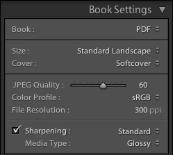
The Book Settings panel (configured for a PDF book) can be seen in the following picture:

PDF Book Settings

In the Book field you can choose the book type you want to produce, and in this case it's PDF book. In the Size and Cover fields you can configure the physical layout of the book. In the current version, the following sizes are supported (which, incidentally, are the same sizes offered by Blurb):
  • Small Square (7x7 in).
  • Standard Portrait (8x10 in).
  • Standard Landscape (10x8 in).
  • Large Landscapes (13x11 in).
  • Large Square (12x12 in).
Unfortunately, the PDF book type isn't as flexible as it should be since it only offers the same book formats (size and covers) available from Blurb. If you wanted to produce a book of another size, you couldn't do it using Lightroom.

As far as the covers are concerned, these are the available options:
  • No Cover (Only available for PDF books).
  • Hardcover Image Wrap.
  • Hardcover Dust Jacket.
  • Softcover.
In this case, the available cover types are those offered by Blurb. However, they're pretty much what you need in a tool of this kind. Major information about this kind of covers can be found on the Blurb website.

Blurb Specific Options

If you're preparing a Blurb book, some Blurb-specific options will be available in the Book Settings panel, as you can see in the following picture.

Blurb Book Settings

First of all, you can choose the paper type for your book. At the moment, the following options are available (further information can be found on the Blurb website):

  • Premium Matte: 148 GSM paper.
  • Premium Lustre: 148 GSM paper.
  • ProLine Uncoated: 148 GSM paper.
  • ProLine Pearl Photo: 190 GSM paper.


Interestingly, the cheapest Standard (118 GSM) paper isn't an available option. Since you cannot downgrade a book's paper using Blurb's web interface, if you want to print a book on standard paper using Blurb, you've got to make a PDF book and upload it to Blurb manually.

Personally, I don't appreciate this deliberate lack of choice. I admit I mostly use Premium paper for my books, but I don't like being forced to choose between uploading through the Book module and paying for a more expensive paper or going through the cumbersome process of uploading a PDF to Blurb manually.

Finally, you can choose whether you want your book to have a Blurb's logo page (the default option) or remove it from your book and pay the corresponding fee.

Setting the Image Quality

If you're producing a PDF book, you can choose a set of parameters that affect the quality of the images generated by Lightroom. If you're producing a Blurb book, you cannot modify the image quality (although it seems like Blurb is using 200 ppi sRGB images, which are good enough and match the resolution of their HP Indigo printers). The available configuration fields are the following:

  • JPEG Quality slider: to set the quality of the exported JPEG files.
  • Color Profile: to set the color profile to use for the images. Available choices are: sRGB, Adobe RGB, Pro Photo RGB or a user-provided color profile.
  • File Resolution: to set the resolution of the exported images.
  • Sharpening: to set the amount of sharpening to apply to the images. Available choices are: Low, Standard and High.
  • Media Type: to set the kind of media the book will be printed on. Available choices are: Matte and Glossy.

Automatic Layout

Once your book is configured, you can start laying out your images. Please take into account that modifying the book settings will result in Lightroom automatically laying out the images on the new page format. You should carefully review your book settings before proceeding to laying out your images if you don't want to lose your work.

A good place to start is the Auto Layout panel. Instead of laying out all the images by hand, you can have Lightroom lay them out automatically using a specified preset and then apply the modification you require:

Auto Layout Panel

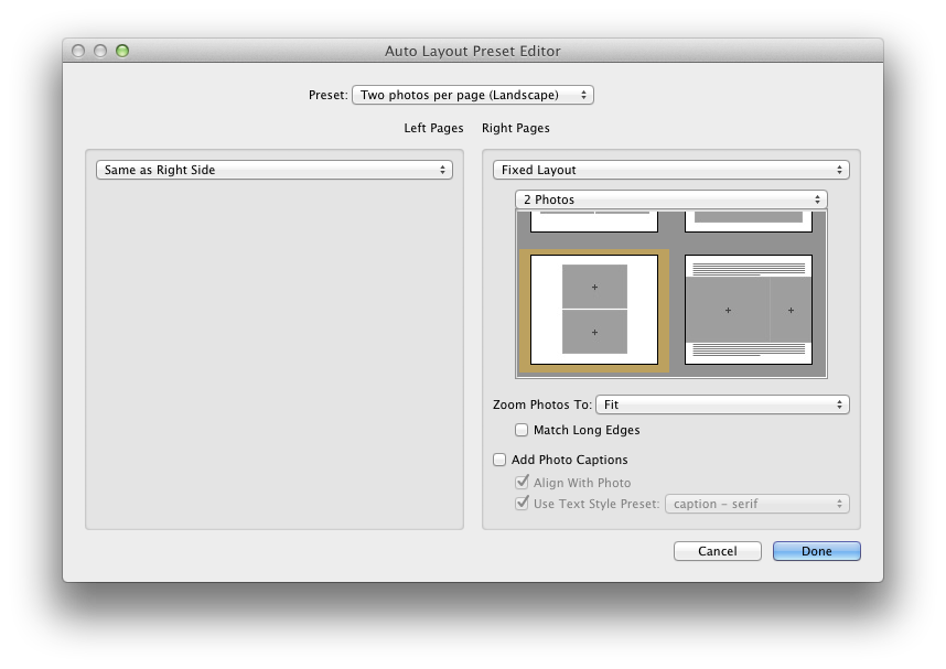
Fist of all, you've got to choose a page layout that Lightroom will use as a template for all the pages of the book. You can use an available preset or create one of your own. The bundled preset are designed to layout a single image on every page. If you want to modify an existing preset, or create a new one from scratch, you can choose Edit Auto Layout Preset… in the Preset list box and a configuration window will appear:

Auto Layout Preset Editor

Using the Auto Layout Preset Editor, you can define the default layout used by Lightroom, specifying:
  • A separate template for the left and right side pages. The templates can be chosen amongst the ones provided by Lightroom. Unfortunately, page templates themselves cannot be modified.
  • The zoom level to be applied to the photos. Photos can be zoomed into place to either fit or fill their destination cell.
  • Whether a caption should be added to each photo and some basic caption format settings.

Once the chosen preset has been set, you can press the Auto Layout button to have Lightroom create your book. In case you don't like the result and change your mind about the desired layout, you can use the Clear Layout button to clear the book and start again.

Laying Out the Images

No matter whether you're starting from scratch or from an automatically laid out book, you can layout your book simply dragging and dropping images into place. Depending on the layout of a page, you will see image placeholders, shown as grey cells, where you can drop an image:

Image Placeholders

Once an image is dropped, its size can be changed using the zoom slider that appear above it. If it does not, just select the image by clicking on it:

Zooming an Image

If you want to change the layout of a page, you can select it (clicking on the area just below it) and choose the desired layout in the Page panel or using the popup that can be accessed using the small black button on the bottom right corner of the page (visible on the previous image). Many available templates are available to place one, two, three or four image per page. Also, a great deal of creative templates are available in case you need to create more unconventional page layouts. Still, since page layouts cannot be customized, some users may find the available options insufficient.

An interesting layout featured by this module is the possibility of easily making two-page spreads like the one shown in the following image:

Two-Page Spread

Customizing the Page

On the right side panel you will find some configuration options that allow you to tune your pages. Here's brief review of some of them.

The Cell panel can be used to change an image padding:

Cell Panel

Using the Amount slider, you can change the padding of the selected image cell. In the following image you can see the effect achieved applying a 60 points padding to a test image:

Padding on an Image Cell

Since available page layout cannot be modified, you will find cell padding more useful than you may think at first sight.

The Caption panel lets you add captions to an image, to a page or to both of them:

Caption Panel

Photo captions can be positioned above, over or below a photo and there can be one per photo. On the other hand, page captions can be positioned above, over or below a single page and there can only be one per page. In the following picture you can see an example of both a photo and a page caption:

Photo and Page Captions

The text of either caption can be formatted using the tools available on the Type panel, a pretty basic text formatting tool that needs to be enhanced:

Type Panel


Page Background

You can change the default white background of a page using the Background panel. You can set either a solid color or a background image (some of which are bundled with Lightroom):

Solid Black Background

Graphic Background

Saving Your Book

To save a book as a specialized Lightroom collection, just use the Book/Create Saved Book menu item (or the Command-S shortcut if you're on a Mac). Lightroom will show the Create Book window where you can customize the collection to be created:

Create Book

Besides common collection attributes such as name and placement, there are specific book options that are pretty handy:

  • Include only used photos instructs Lightroom to create a new book collection including only the photos that are actually placed on a page. Any other existing image in the source collection won't be included in the newly created one.
  • Make new virtual copies instructs Lightroom to create a new virtual copy of every image included in the book collection. This option is useful if you want to isolate the changes you will apply to book images to the newly created virtual copies, instead of having them propagated to the source image.

Publishing Your Book

Once your book is finally complete, it's time to publish it. To export a book to PDF, just use the Export Book to PDF… button:

  • If your book is a PDF book, this button can be found at the bottom of the right side panel.
  • If your book is a Blurb book, you can still export it as a PDF, but the button will be located at the bottom of the left side panel.

If, on the other hand, you want to publish a Blurb book and send it for printing, you've got to use the Send Book to Blurb… button located at the bottom of the right side panel.

Conclusion

Lightroom's Book module is an easy to use, yet powerful tool that lets you easily create and publish photo books. I'm sure that many amateur photographers will appreciate it since it fills a long standing gap with other tools (such as iPhoto or Aperture), even less sophisticated than Lightroom, that have been providing such feature for a long time.

Moreover, and more importantly, this module is well integrated into Lightroom and you will continue to benefit from its the goodies without any disruption to your workflow. While it's true that it's not very flexible, even less than the original tool it's derived from (Blurb BookSmart), it has the great advantage of being an integral part of Lightroom and your productivity will surely benefit from it. Should you need a more complex tool, you could switch to a fully fledged desktop publishing solution (such as Adobe InDesign).

If you want to help me keep on writing this blog, buy your Adobe Photoshop licenses at the best price on Amazon using the links below.

Sunday, March 4, 2012

Adobe Lightroom Tutorial - Part XX - Exposure vs. Brightness

Part I - Index and Introduction
Part XXI - Making Photo Books

One of the questions I'm most frequently asked for by both blog readers and friends is:

"What's the real difference between Exposure and Brightness."

The answer to this will soon be irrelevant: the Brightness slider has been removed from the new development process (2012) shipped with the upcoming release of Adobe Lightroom. I quickly described some of the changes that we'll see in Lightroom 4 on a previous blog post and I described the major differences between the current development process and the new one. Also, I stated I'm really glad that both the Exposure and the Brightness tools have been merged into a new tool, still called Exposure, whose behaviour I find more intuitive and predictable.

However, here's a quick summary of the major differences between Exposure and Brightness in Lightroom and how you could take advantage of both to improve your results.

First of all, let's have a look at the authoritative "answer", although not satisfactory, that comes directly from Adobe. The Lightroom 3 official documentation, that you can find here, states the following (this is an excerpt):
  • Exposure: Sets the overall image brightness, with a greater effect in the high values.
  • Brightness: Adjust image brightness, mainly affecting midtones.

Lightroom documentation also suggests you adjust the overall tonal scale before adjusting the brightness.

Information provided by the documentation is crystal clear, but clearly insufficient. Although hinting at a major difference in how they alter the tonal scale of a picture, it fails to explains the real difference between them, leaving Lightroom users experimenting and trying to learn by trial and error. Furthermore, but this is just a personal opinion, the documentation only tells an half-truth. Based on my experience, in fact, the description is both incomplete and deceiving. In the following sections we'll see why.

In this blog post I'll use the following photo (unedited) as a test bench:

Grey Gradient - From Zone IX to Zone 0

Exposure and Brightness Behaviour

For small adjustments, both exposure and brightness will produce very similar results: you will begin seeing some differences when you push these sliders farther, on either end.

Let's begin increasing either adjustment:

Exposure: +2

Brightness: +100

The effect of the exposure increase on the image is greater than the effect of the corresponding brightness increase throughout the range.

The first thing we notice is something we already knew: as I've often stated in this blog, exposure is much less forgiving than brightness and burns the highlights very quickly. In fact, both zone VIII and zone IX are burned when increasing exposure by 2. On the other hand, increasing brightness has a much gentler effect on the highlight: in fact, no zone is yet burned out.

If you push these adjustments further, this behaviour is even more evident:

Exposure: +3

Brightness: +150

After increasing exposure by 3 steps, Zone from VI to IX are completely blown out. On the other hand, when increasing brightness to 150, zone IX is burnt (and zone VIII is very close to being so).

A similar behaviour can be observed when reducing a negative adjustment with these tools:

Exposure: -3

Brightness: -150

When decreasing their value, the effect of a brightness reduction is now greater than the effect of the corresponding exposure reduction. Once more, the overall effect of a brightness adjustment throughout the range is gentler and more uniform than the effect of an exposure adjustment. Also, a brightness reduction has a stronger effect on the shadows than an exposure one although, in this case, no zone has gone into zone 0 (pure black).

We can draw the following conclusions:
  • The overall effect of a brightness adjustment is gentler and more uniform throughout the dynamic range in both directions.
  • Increasing the value of either tool has a stronger effect on the shadows.
  • Decreasing the value of either tool has a stronger effect on the highlights.
  • Increasing exposure quickly burns the highlights and has a stronger effect throughout the range.
  • Decreasing brightness has a stronger effect throughout the range.


This basically mean, also, that the effect of either tool is not linear throughout the range, peaking at a specific value: the shadows, when increasing their value, or the highlights, when decreasing it. However, the overall effect of a brightness increase is more gentle and uniform throughout the dynamic range.

This asymmetric behaviour has interesting consequences that, once understood, can be incorporated into your workflow to improve your results:
  • If you need to reduce the highlights of a picture (relatively to other ranges), you should consider reducing the brightness. 
  • If you need to increase the shadows of a picture (relatively to other ranges), you should consider increasing the exposure.

Using this asymmetry at your advantage may signify improving the tone distribution of your image, especially when you want to push back the highlights towards the middle tones while retaining all of your shadow details and, on at the same time, preserving the natural look of your image.

Some Example Pictures

I took this picture on the Roman Bridge in Salamanca using matrix metering and no exposure compensation:

Original Image - Matrix Metering - Exposure Compensation: 0 EV

Clearly, the sky and the colour of the rock deceived the camera and the resulting image is pretty overexposed. If we try to fix this picture using only the exposure slider, using the church as a reference, an acceptable result could be the following:

Exposure: -1

Not bad, but I'm not satisfied with the tone of the shadows nor with the overall tone distribution. This is a consequence of how exposure works: decreasing exposure has a stronger effect on the highlights, but the effect throughout the range is less uniform than brightness' (as seen in the previous zones samples).

Let's try to reduce the highlights bringing brightness down:

Brightness: -10

Please beware that, at least when processing Nikon RAW files (NEF), the default Brightness value is 50, not 0. As a result, the brightness value of the previous picture has been decrease by -60. The result is much more satisfactory, as far as it concerns overall tone distribution.

Starting from this picture, we can further tweak it until we're happy with the result. In this case, I'd just apply a small exposure adjustment to bring some light back into the shadow range:

Exposure: +0.1 - Brightness: -10

The following picture suffers from the same problem:

Original Image - Overexposed

Trying to bring the rocky cross and the church into a satisfactory range using exposure gives this result:

Exposure: -1

Once again, the result is somewhat flat and the tone distribution doesn't feel natural. Using both brightness (to reduce the highlights) and exposure, we obtain:

Exposure: -0.2 - Brightness: 0


Look at the much more natural color of the rock: this is a much better starting point for further processing.

Clipping and Color Shift

One of the the issues a photographer is always struggling with is clipping and all its incarnations. This is true both on camera and in post production. The exposure sliders in the current Lightroom development process (2010, in Lightroom 3), is the risk of clipping some channel when increasing its value.

When working in the digital domain, tools may be less forgiving than film and paper are, since clipping is a phenomenon that occurs abruptly. Hopefully, this problem will be partially mitigated in Lightroom 4 but, in the meanwhile, we've got to live with it.

One of the problem that may arise when clipping a channel is color shift: when a channel fills up, the relative proportions among the channels cannot be respected and the hue of some colors may begin to drift.

That's the reason why I never push any tool any further when a channel start to clip. If I need further tonal adjustment, I'd rather use the curves instead, leaving the white point fixed.

Unexpectedly, color shift is another reason why you should consider brightness over exposure. This is a reference image I'll use to explain this problem:

Color Reference Chart

This color reference chart is made up of three rows, each of which contain:
  • A pure RGB color in the first square.
  • Two differently saturated versions of the same color on the remaining two squares.

This is what happens when increasing either exposure and brightness over a certain level:

Exposure: +1.5

Brightness: +150

It's evident that exposure and brightness treat distinct RGB channels in a different way. With a 1.5 exposure adjustment, you can clearly see a color shift. Indeed, if you take a measurement of the darkest squares, corresponding to pure RGB colors, you get:
  • Red: (220, 61, 68)
  • Green: (221, 255, 160)
  • Blue: (125, 76, 255)
On the other hand, measuring the color of the same squares when a brightness adjustment is applied, you get:
  • Red: (223, 91, 96)
  • Green: (223, 255, 211)
  • Blue: (122, 122, 255)
I'm not sure about the rationale behind this, but I suspect the exposure behavior is related to the characteristics of the human eye: since we're not equally sensible to light waves of different lengths, "lightening" a color is not a linear process amongst the RGB channels. That's pretty evident if you look at the relative luminance equations in colorimetric spaces.

If, on one hand, the exposure behavior may be justified, on the other hand you should be warned that strong exposure adjustment may lead to undesired color shifts.

Conclusion

Although similar, exposure and brightness have got completely different behaviour throughout the tonal range. Learning to use them is critical to master Lightroom and get the best out of your pictures. Also, every picture is unique and there's no rule but your personal taste when deciding which adjustments to apply in post production.

As we've seen, using one or the other may lead to very different results and even to unexpected (and undocumented) problems such as color shift.


If you want to help me keep on writing this blog, buy your Adobe Photoshop licenses at the best price on Amazon using the links below.